Sketch proposal for a steeply sloping Raglan site overlooking the inner harbour, on a site with fierce restrictive covenants--and which itself is heavily overlooked.

%5B7%5D.jpg "Image (10)")

The Organon Architecture Blog
Sketch proposal for a steeply sloping Raglan site overlooking the inner harbour, on a site with fierce restrictive covenants--and which itself is heavily overlooked.
Every place, every region, has a house form that’s unique to that place – unique because of history, because of climate, because of landscape or way of life.
Given what we have here in New Zealand, and our relaxed way of life, here’s how the New Zealand house appears to me, in oomparison to some of the house types of other times and other places . . .
Labels: Architectural Mini-Tutorial, Architecture, New Zealand
Open plan living is a vast improvement on life in a box -- or in a series of boxes, which is what describes most traditional houses, unfortunately.
But it’s not enough just to be “open plan.” The biggest open plan space is just a field, right? Good open-plan living still requires a delineation of spaces within the larger space – it’s just more difficult for the designer to ensure the right degree of separation between the sub-spaces, and the right amount of integration of each sub-space with the main space.

It’s important that the definition of each each space within the larger whole is done a subtle manner so as to avoid there simply being a space like 'one large barn.' Some popular methods of achieving this separation are:
The method by which the separation is achieved is usually dependent on the extent and quality of the spatial separation required.
All these methods of suggesting separation of spaces, from subtle to obvious, can be used in virtually every open space. In fact, one of the best places to see these methods in action "out in the wild" is in some of the best-designed bars and pubs, which use virtually every method there is to make small sociable, friendly spaces within a much larger whole. And here's one of the most effective methods to do this job:

A ceiling deck is essentially a lowered “ceiling slab'” that you can see over, and in which you might have downlights, uplights and all your other services. (Great for future proofing because it's very easy to rewire!)
Your cunning designer can use ceiling decks to frame a space; to separate two spaces; to direct a view; and to give order and pleasurable contrast to a series of different-sized (or even same-sized) spaces.
If you've got them at the right heights, by playing off expected proportions with the unexpected proportions you build in, you can really begin to make a small space appear very much larger indeed.
And oddly enough, if the “decks” are done well and they become the primary ordering element of a space – the means by which all the space in your building is “read” – then your walls and all the home's other enclosures start to lose their importance. You’ve started to “break the box”-- reducing the sense of enclosure without removing the sense of place a home should give you.
Which maybe explains why you see them so rarely. Most modern designers like boxes. And they despise subtlety.
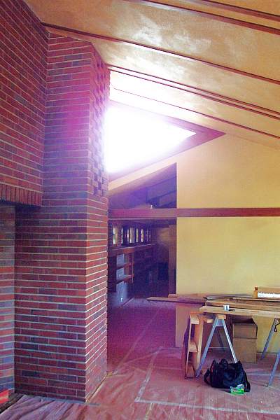
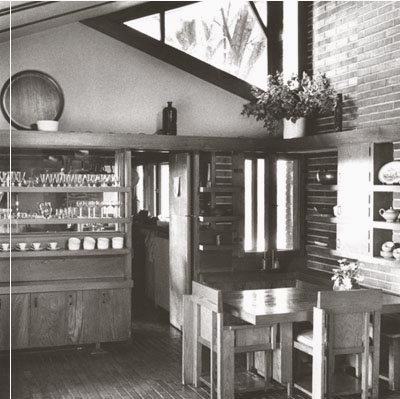
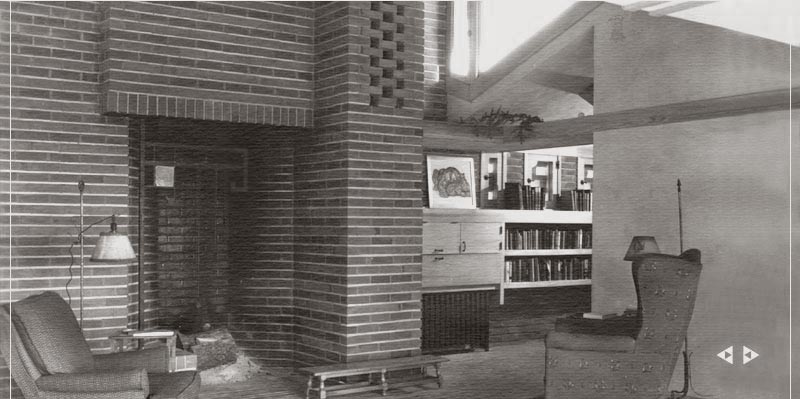
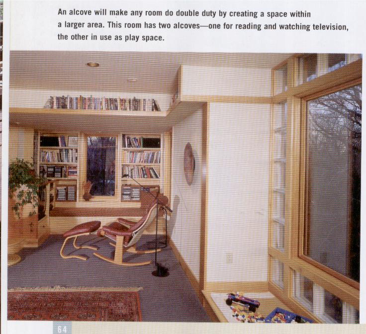
Ceiling decks offer a particularly subtle way both to 'frame a space' and to divide one space from another, but also – if you do them well -- lowered ceiling decks that 'frame' a space help to make that space and those around it appear larger than they are.
So basically, a lowered ceiling deck is simply a lowed or independent part of a ceiling, usually horizontal in the manner of an above-ground 'deck.'
Why do they work so well? Well, here's one reason--your "space bubble." See:
Each of us has our own personal space bubble--and, if we're with friends or family, a social space bubble within which we feel our personal space is contained.
Ceiling decks help "frame" these larger bubbles to give real presence to a space. And with lower decks, they offer a very good way of "squeezing down" a space bubble over eating areas for example, or at an entrance, which can then be "released" into a larger space--the contrast between the two making the large space feel larger and the lower space cosier.
This is simply a three-dimensional use of the technique of “containment” and then “release” used for centuries by the designers of Japanese landscapes and courtyard gardens. The same technique built in and updated.
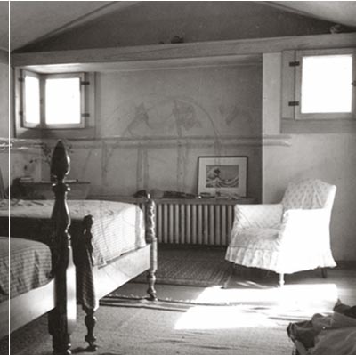
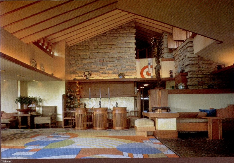
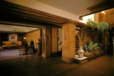
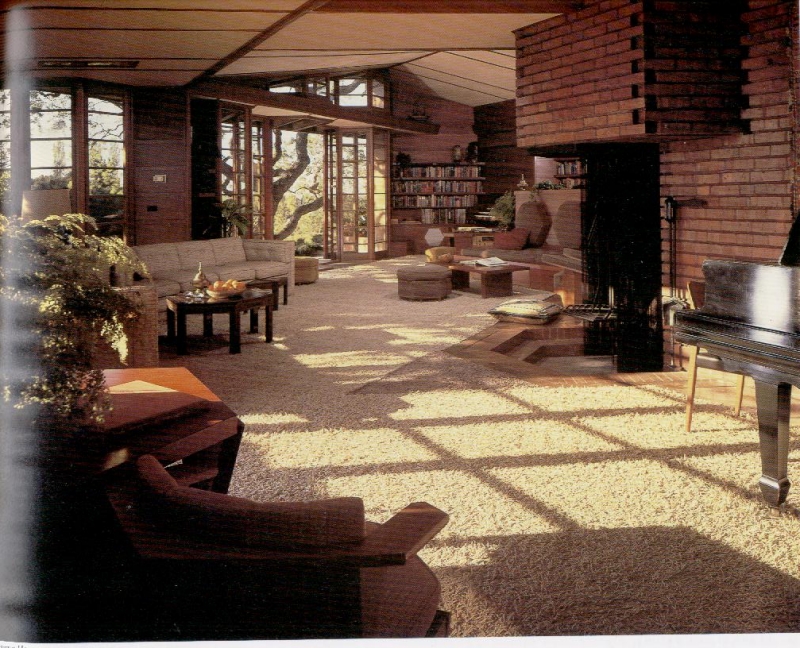
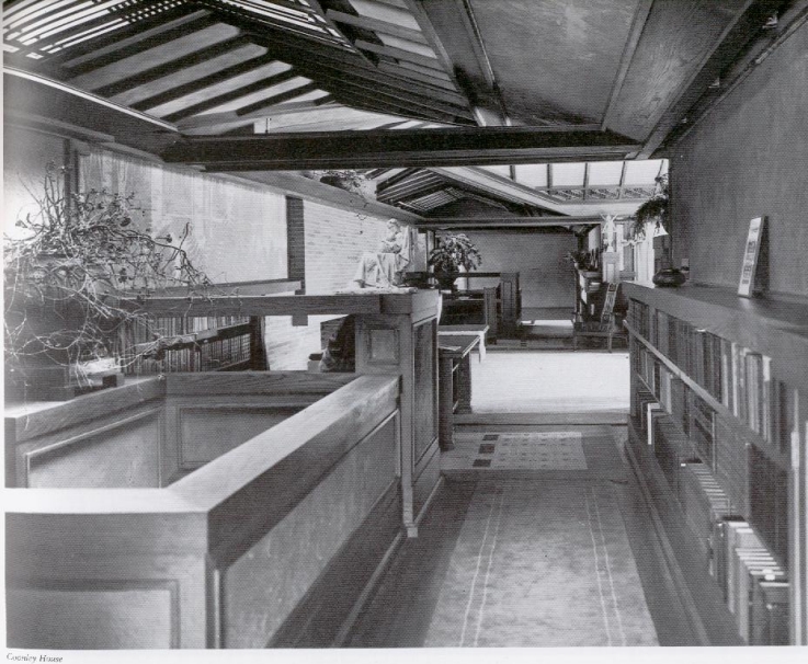
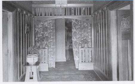
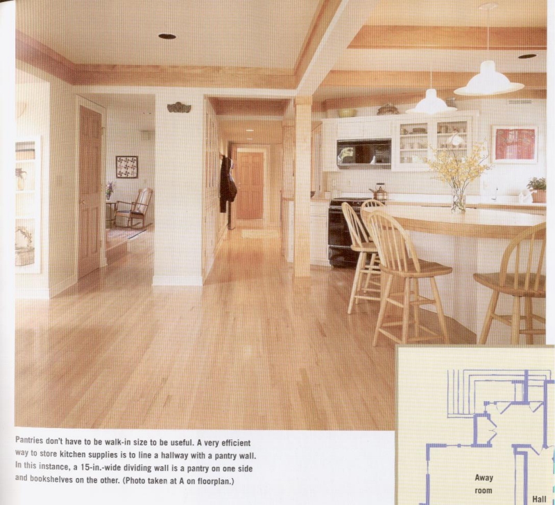
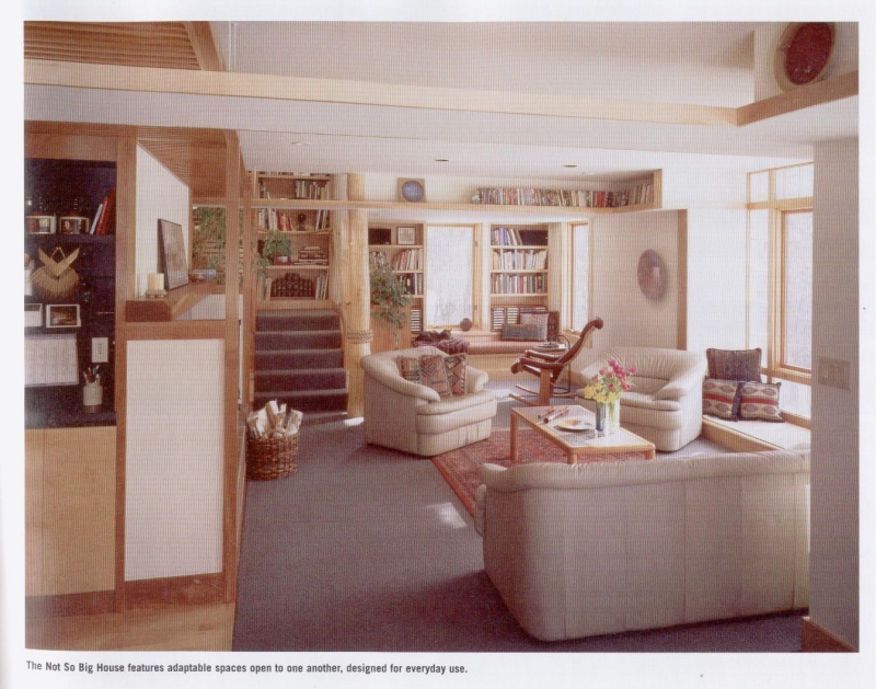
A ceiling deck, or a lowered ceiling, can be in any style and suit houses of any era. Here are some examples of lowered ceilings, ceiling decks, ceiling dividers and “picture rails” (used to suggest a lowered ceiling) using different styles, and from different eras, all of them successful. See if you can see all the designers are hoping to achieve in each case:




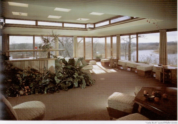
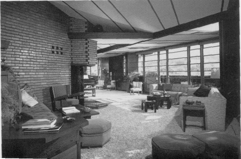
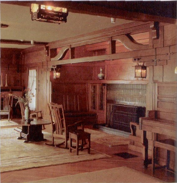
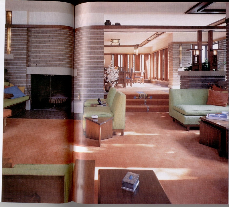
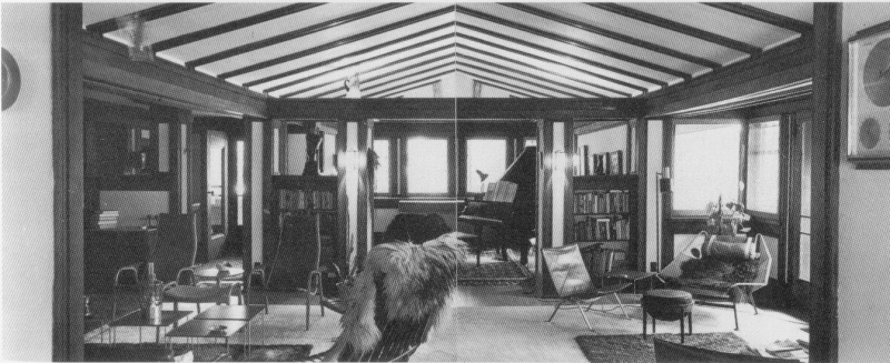
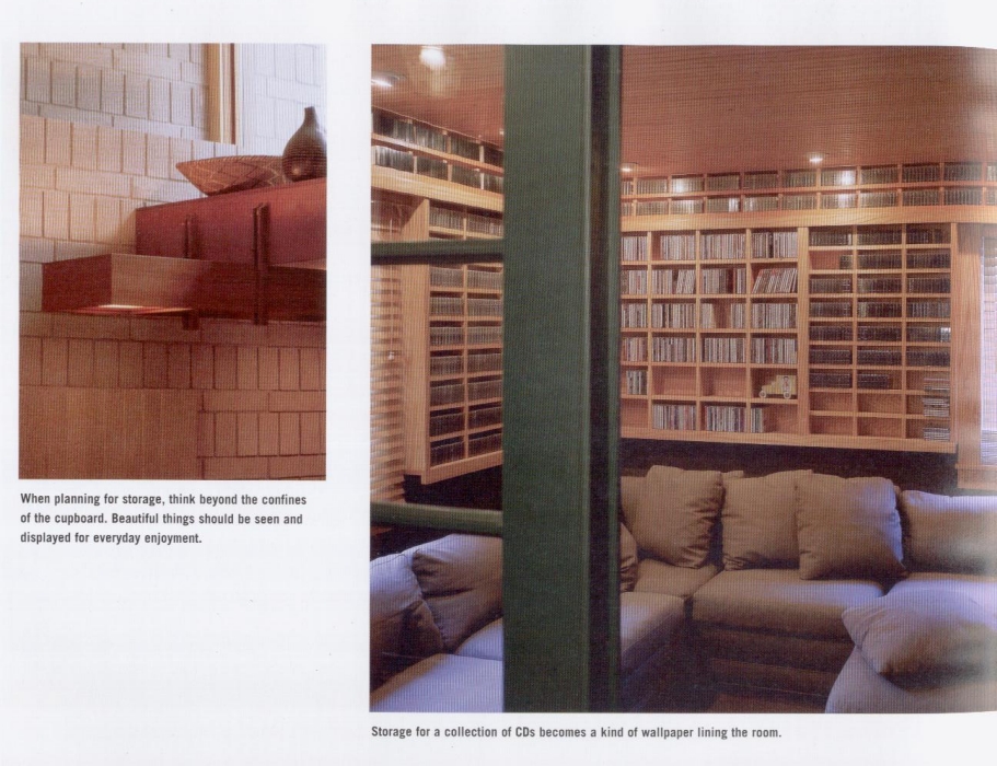
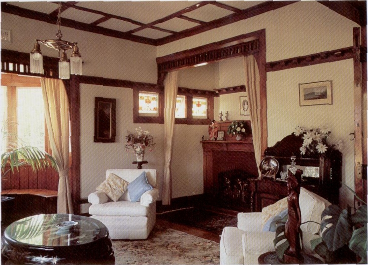

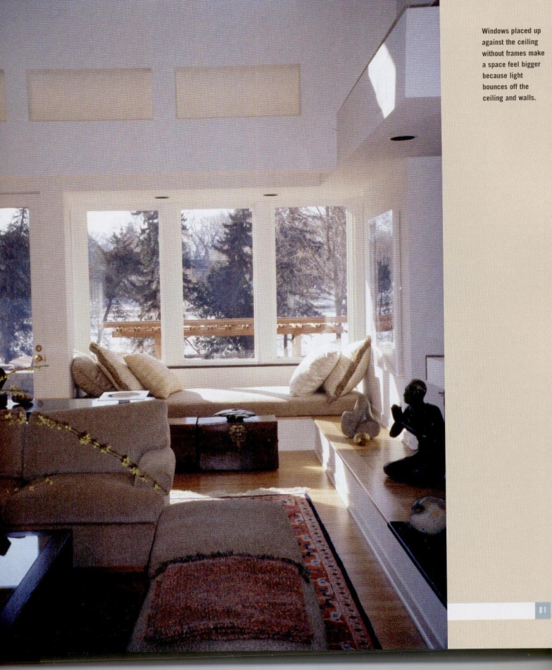
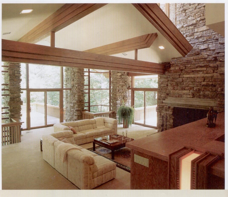
Labels: Architectural Mini-Tutorial, Architecture
This was my entry to the Queens Wharf ‘Party Central’ competition—a two-week only design competition (one A1 page only for the submission) that sadly became just another stillborn apology for mediocrity.
This Is Party Central on the Water. And It’s Got It All!
It’s a Permeable Ampitheatre – an Organic Palisade that gathers together the disparate energies of the waterfront, that relates to the scale of the Waitemata’s sparkling waters, and embraces the city, the harbour and the gulf.
It takes Queen Street out to the water – just where it was 50 years ago!
It gathers public, protected spaces around a raised amphitheatre at the water’s edge – with the Harbour and the Gulf as the stage, and waterside promenades on all sides.
It links pedestrians to the sea! Pedestrian ramps take away the twin barriers of the red fence and the road, and take pedestrians right into the heart of Party Central, and out to the harbour. The ramps interconnect up and down around the amphitheatre creating movement, circulation and excitement.
It features small, multi-functional, lettable spaces on each ramp, at each level. Cafes, bars, a food hall, meeting places, souvenirs, supporters’ headquarters and regalia; press, media, and TV crews; visitors from round the world will rent these spaces for a world trades fair of tourist centres, exhibition centres, and trade stands. Downstairs there’s space for car rental offices near cruise terminal and ferries. Keep the place busy from sunrise until late. (And use the rents instead of ratepayers’ money to finance development.)
It has a spiral-ramped Lookout Tower to experience the world’s greatest harbour – to look out to Mt Victoria, North Head, Rangitoto, Great Barrier, Coromandel and beyond – a Lookout Tower that after the Rugby World Cup will be fitted out into a world-class, water’s-edge Theatre, Gallery, Exhibition centre.
It’s a Lookout Tower that’s a Rugby World Cup Event -- with flag poles flying the flags of each playing nation: at the start of the tournament in order of their seeding, by the end of the tournament in order of their finishing. Which TV network could resist starting and finishing their daily RWC broadcast with a backdrop of competing nations’ flags, in ranking order, with the world’s most beautiful harbour beyond.
It has a Big Screen in the forefront of the Amphitheatre, viewable from every level. The screen rises up from its home at lower (ground) level on the Ampitheatre’s ‘stage machinery’ to become the focus of Party Central. After Rugby World Cup the same machinery can be used to elevate a Sound Shell to make this the outdoor Ampitheatre of choice for medium-sized open-air productions.
It has an Inflatable, Double-skinned Shell Roof used for wet weather events, tied down and filled with inflatable gas – floating above the revellers like one of New Zealand’s famed paragliders. Elliptically-shaped and with the RWC ball-sponsor’s logo (in return for a financial contribution for the floating roof), it becomes an unavoidable magnet for people and for the word’s TV cameras.
It has new jetties on the new public wharf for ferries and water taxis – needed for the new routes and services laid on for RWC and beyond.


On reflection, I probably should have forwent the computer generated ‘concept’ pics and gone with more explanatory pencil sketches. Something to remember for next time.
Still, it was fun to do.
Here, for example, are some sketch floor plans to give you some idea of how it all fitted together what’s proposed, from the bottom up (ie., from terminal entrance and circulation; to the main promenade level, and a typical ‘lettable’ floor.


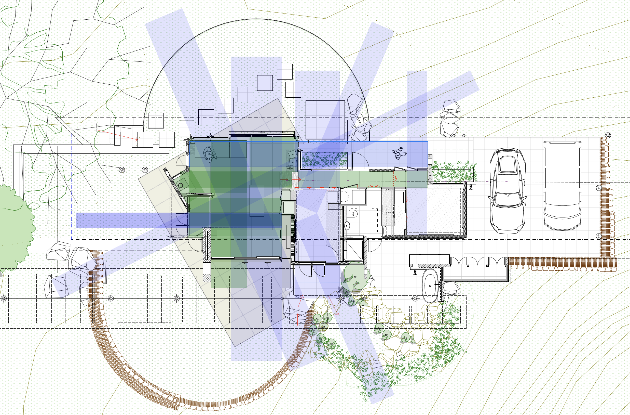
Look at how the methods described above are used in the two deceptively simple plans below to suggest larger space than there is, and to link the spaces within to the landscape outside (you should be able to click on them to enlarge them).

I hope this has helped you to see more clearly how architectural space is about more than just laying out wee boxes. :-)