Monday, June 29, 2015

Montessori School, by Organon Architecture

image

So some of you have been suggesting I start posting more regular art and architecture posts again. And others have suggested I post more of what I’m designing myself.

So at the risk of boring my other reader, and the troll, here’s something that’s on the board at the moment: a new Montessori school, with 3 classrooms, quiet decks, parents space, shared kitchen, internal garden ...

DraftLayout

Thursday, June 25, 2015

More from Castlecrag

So just in case you missed the answer to my question posed on Monday: my (very poor) photos were posted from a place called Castlecrag, which is a suburb embracing Sydney’s Middle Harbor that was developed, designed and laid out in the 1920s by former Frank Lloyd Wright architect Walter Burley Griffin

He and his wife Marion Mahoney (another Frank Lloyd Wright alumni) designed 40 delightful stone and “knitlock” houses for the “natural subdivision,” of which 15 were built.

You might call it “Walter Burley Griffin’s Australian Eden.”

His aim was a community of modest houses sharing a natural landscape, with few boundaries between.

The Griffins personally undertook the design of the roads and allotments with the winding roads following the contours of the landforms. Communal areas were linked together with a network of walkways to provide open spaces, retain views and achieve maximum amenity for all residents. Equally important was respect for the native Australian landscape which the Griffins had come to understand and admire. In Castlecrag they set out to demonstrate that architecture and landscape should be integrated so that '…each individual can feel that the whole of the landscape is his. No fences, no boundaries, no red roofs to spoil the Australian landscape; these are some of the features that will distinguish Castlecrag.'

You can still experience the vision in parts of the place.


The all-but fully restored Fishwick House, above (from its neighbour) and below (from the street).
The current owner resisted the temptation to restore the former fish-tank skylights
that were originally part of the dining room ceiling. Yes, actual fish tanks.

Hard to photograph, and seemingly very interior, these remain beautiful houses to be in…

… and around.

Wilson House with Ula Maddocks and daughter Deirdre and three others, 1930s

[Pics from GriffinSociety website and National Library of Australia]

nla.pic-vn3603884a-s469-v

FULL DISCLOSURE: I may well be offering advice on the restoration of one of these beauties.

Quote of the Day: On the Sydney Opera House

image

“The sun did not know how beautiful its light
was until it was reflected off this building.”
- architect Louis Kahn.


[Pic by Paul Reiffer]

Quote of the Day: On the Sydney Opera House

“The sun did not know how beautiful its light
was until it was reflected off this building.”
- architect Louis Kahn.

Tuesday, June 16, 2015

Architectural Mini-Tutorial: Organising our visual field

If we want to “break the box” instead of make a box, when we build our houses we need a few tricks up our sleeve.

A while back I talked about how ceiling decks are one of those tricks. Another is using “nested spaces” within a place.

Today I’m going to talk about how the way we perceive what’s called “the visual field” in front of us can be used to reduce the sense of enclosure.

It seems almost obvious to point out that we can never see all of a building at once. In The Dynamics of Architectural Form, Rudolph Arnheim discusses this, explaining that we perceive architectural space only “in pieces,” by eyes and head “roving back and forth over the edifice and by traversing around it,” and combining these in memory to build up a 3d model in our mind. And like coming to understand a painting, he says, we begin by examining the “visual field.”

In observing a painting, this perceptual process identifies the various elements and relations that constitute the work. A perceptual listing is prepared consisting of a description of shapes, an identification of each colour, and an examination of the relations of individual elements.1

In a shorthand way, this means identifying all the main visual elements you see – shapes, lines, colours, relations between elements -- that visually organise the space. This doesn’t mean identifying the elements that hold a building up (although in many a good building the two things coincide) but the things in your visual field that constitute the main visual presence.

In a sense, the elements visually organising the space would be the main lines you would sketch if you had just, say, a minute to draw your point of view – or what you would see if your squinted your eyes.

Consider the 2d representation of the space below built a few years back in Hamilton:

Hamilton Organic Architecture

So, what are the main shapes, lines and colours organising the visual field in this picture?

I’ll give you a moment while you squint your eyes, or scratch out a quick sketch. (Don’t worry if it’s a bit rough.)

Okay, here's my two-minute sketch, at the bottom of the page, below the fold.

The point being that the dominant elements organising the visual field for the observer, from this view, are primarily:

a) the vertical masonry piers,
b) the coloured vertical 'pier' at the end of the main space,
c) the vertical corner to the left, and
d) the floating ceiling deck overhead.

Why is that important to what I’m talking about here? Because, crucially, NONE OF THESE ELEMENTS CONTAIN THE SPACE.

Think about it. Look around the box you’re undoubtedly sitting in now. In a simple box, what defines the space visually – what defines each observer’s visual field within the space -- are the very things that contain the space, i.e., the walls and ceiling. So the visual field offers you a sense of containment.

But if you can define the space without reference to the things that contain it, then the 'container' starts to disappear, and space appears to flow more freely. The visual field offers you a sense of freedom.

In other words, by taking away the visual dominance of the things that contain your space, you allow the sense of space itself to dominate.

In other words, this is one way to begin BREAKING THE BOX.

There are two bonus features with this little trick.

  1. As you can see in my sketch below the fold, the ceiling deck is a major element in organising the visual field. If we can then take this outside by means of pergolas, say, that will essentially take this same organisational motif outside, then we can really begin organising our perception of space both inside and out without reference to our “container,” and we can begin to realise “inside-outside flow” much more dramatically than by simply adding a few sliding doors.
  2. If our organisation of the visual field is strong enough, then we can “clutter” our kitchen benches and tables as much as we like, because the organising elements will still be be organising the visual field for us; unlike in those stark bare boxes you see in magazines, that look untidy with a small coffee cup on a pristine bench.

In short, it’s a simple yet relatively sophisticated method by which to make a space for relaxed day-to-day living with a genuine sense of freedom.

Cool, huh.

Wednesday, September 10, 2014

Restoring Wright Buildings with 3d printing


Frank Lloyd Wright’s Millard House or “La Miniatura”

While everyone has been talking about trying to 3d print houses, Frank Lloyd Wright’s ‘textile block’ buildings are being restored for pennies in the pound with 3d printed textured blocks.

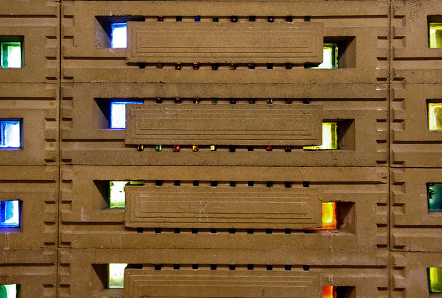
His Annie Pfeiffer Chapel at Florida Southern College—part of a composition of twelve buildings at the South Florida campus designed as a “harmonious whole expressing the spirit of the college free from grandomania:--has had a makeover with the help of 3d-printed textile blocks replacing weathered and aged blocks.

The cost to recast Wright’s blocks by hand proved prohibitively expensive in the past…until the arrival of the affordable 3D printer.
    Thanks to a $50,000 grant from the Florida Division of Historical Resources and the emergence of affordable 3D printing technology, the Annie Pfeiffer Chapel was
recently restored in exacting architectural detail.
    Architect Jeff Baker of
Mesick Cohen Wilson Baker Architects oversaw the 12-month grant project, turning to the aid of 3D printers to replicate and replace what was once a tedious manual process. 3D printing significantly reduced both cost and effort to complete the architectural restoration, allowing Baker’s team to integrate 2,000 distinctive coloured glass tiles into Wright’s original design textile blocks, recreating the jewelled box effect envisioned by the architect.
    “The success found on this project is a milestone not only in the restoration of Frank Lloyd Wright buildings on the FSC campus but also for similar textile block projects designed by Wright and other architects throughout the nation,” enthused Baker.

This opens up possibilities not just for restoration, but for new textile block buildings as well.

And not just new textile buildings – new and economical methods of applied ornament as well. Just imagine what Wright’s master Louis Sullivan could have done with a few industrial 3d printers!

Coping of Louis Sullivan’s Wainwright Building


[Pics from http://prairieschoolarchitecture.tumblr.com/, Florida Rambler, Design Milk, When the Sidewalk Ends and 3dprint]

Monday, June 10, 2013

Airports: They’re about making an entrance!

Madrid-Barajas Airport, Madrid, by Richard Rogers
Richard Rogers’ Madrid-Barajas airport.

Architectural critic Paul Goldberger reckons that airports today are like the great railway terminals of yesteryear: the gateway to the adventure and romance of a new city. In short, it’s all about arrival--something most airports do so poorly.

Where they exist at airports, he says, the more impressive spaces are usually located in the airports' departure halls. Those passengers are rushing to clear security and catch flights and don't have time to appreciate their space. The arrivals hall usually doesn't inspire much.
    "When you arrive, you're shunted to a lower level to baggage claim and go through what feels like a service (exit)," says Goldberger, who regularly flies through New York and New Jersey's bustling but not very beautiful airports.
    Although most airports don't meet his wish for a "grand welcome" -- even the ones he likes -- some architects are designing lovely airports that are worth admiring.
Here are some of the airport designs Goldberger has appreciated or is hankering to see for himself.

Architect Richard Rogers brought beautiful changing colors to Madrid-Barajas Airport in Spain. The main terminal's departures area is shown here.
Richard Rogers’ Madrid-Barajas airport, departure area.

Light comes through large skylights into the circulation systems at Madrid-Barajas Airport's check-in and departures area.
Richard Rogers’ Madrid-Barajas airport, check-in and departure.

Wednesday, June 05, 2013

Coonley House, by Frank Lloyd Wright

Image GalleryBuilt in 1907, Frank Lloyd Wright’s Avery Coonley House went on sale a couple of years ago and sold for nearly US$3 million. More importantly, the sale allowed pictures of the masterpiece in its current state to leak out to the internet.

Image Gallery

It seems that apart from some previous owner having severed the link between the main house and the bedroom wing (which is a very big “apart from”!)  the remaining “main house” is looking in tip-top shape.

Almost as beautiful as the day it was born!

Image Gallery

Architect Garret Eain offers a short overview of the restoration.

This is your way in from the street…

Wednesday, May 15, 2013

Yes, you can buy Claude Megson’s house…

40FernGlennreshoot

Now for sale by new owners, here's late architect Claude Megson's own house, perched above tree-clad Dingle Dell in Auckland's St Heliers, with views in the other direction out to Rangitoto and the harbour. A simple looking exterior concealing an awful lot of living within.

image

Megson took the small, boxy, brick house (right) designed by the architect of the Holy Trinity Cathedral, Richard Toy, and transformed it into something magical, something giving the feel of having discovered a particularly poignant tree-filled glade somehow touched by the gods.

Writing about the transformation a few years ago, architectural critic John Dickson said of it, "It is impossible without the process of Megson's imagination to connect the cluster of small, confined rooms of the house as it was to the expansive, multi-levelled, vertical-fissured, spatial-phantasm that it has become."

A new structure was built over the original brick base, with balconies - described by [former Megson student] Andrew [Barrie] as "cages of mesh and steel tube" - projecting from the house out into the treetops… Andrew Barrie says Claude was a world-class architect. "His houses brought a sculptural quality but they were also incredibly tied to the way people live. Usually, it's one or the other and to do both was unusual ... there were few like him."

For Megson a house was a lot more than just a machine for living—the family house for example house should support and enhance family life, celebrating and artistically expressing all its many aspects. 

And English architectural critic Professor Geoffrey Broadbent, writing after a 1992 tour of Claude's Auckland houses had this to say:

"This," I said to myself, "is work of a very high international standard indeed." ...One is constantly struck by the surprise around the corner, the bright shaft of light penetrating from above into the softer glow of the main living spaces -- especially in Megson' own house -- that give his work such very special qualities...
There is an essential "rightness" about Megson's spaces, for pleasant occupation by ordinary, normal human beings. Such things, says Dickson, have gone out of fashion with today's students. Well, so much the worse for the students [and their clients!]. Perhaps it hasn't occurred to them that if they design real spaces for human comfort and pleasure, then even those anguished souls overwhelmed by post-Heideggerian "problematics" about the nature of their existence might, given spaces like Megson's to contemplate that nature of their "Being," come to more positive conclusions! Because that's the point about Megson's spaces; they are life-enhancing.
Broadbent, for once, is exactly right.

495700

Claude built the house for his own family as a classic three-zoned family house: with parents’ realm and childrens’ realm’ linked together through the house’s public realm.  Agent’s photographs suggest the current owners (and vendors) have retained this spatial planning (well expressed in the exterior, as you can see below), but have restored the house and kitchen elements so they are “largely as they were.”

132468352_full

You may buy it through Barfoot & Thompson.

132468362_full

[Photos by Ted Baghurst and Barfoot & Thompson. More pictures here and here.]

image

495700G

Click to enlarge…

495700C

495700D

495700F

495700O

495700R

495700T

495700U

495700X

132468334_full

132468356_full

132468371_full

132468374_full

132468382_full

132468386_full

132468391_full

132468398_full

132468401_full

132468404_full

132468429_full

Childrens Realm

Deck