Inspired by my good friend Michael Newberry, from whose mini-tutorials on art I've learned so much, I've decided to post regular mini-tutorials on architecture to help interested readers learn a little of the elements of honest architecture.
I'm starting my first mini-tut by looking outside - which is is in fact the essence of good architecture: to link inside and outside. The very best demonstration of that principle at work is in traditional Japanese garden design, where it is considered essential to make the viewer part of the landscape.
The starting point with Japanese garden design (and in fact all good garden design), is to start from inside looking out. The main methods used to "capture a view alive" are either to link foreground and background with a middle ground, or by dynamic lines and forms leading the eye out into the landscape to capture it alive and make it part of your own space. In the words of one Japanese garden designer, the scene must lose its "thereness" so as to put the viewer into the frame.
These methods have been formalised under the principle of shakkei, or the art of using "borrowed scenery." As Teji Itoh explains:
“The literal meaning of the Japanese word shakkei is ‘borrowed scenery’ or ‘borrowed landscape’—that is, distant views incorporated into garden settings as part of the design. In its original sense, however, shakkei means neither a borrowed scenery or a landscape that has been bought. It means a landscape captured alive..
“Its implications run more or less like this: when something is borrowed, it does not matter whether it is living or nor, but when something is captured alive, it must invariably remain alive, just as it was before it was captured…
“[From the point of view of Japanese] gardeners and nursery-men of former times … every element of the design was a living thing: water, distant mountains, trees, and stones. Without a realisation like this, it is impossible to perceive the essence of a borrowed landscape garden.”
These are some of the main elements used in such a garden to achieve the goal:
Trimming: Trimming of the view eliminates non-essentials, allowing one to focus on the essence, ie., the distant view. It is traditionally common to use low clay walls, pruned hedges or low hills or embankments, but the same principle can be utilised with any material, or even (as Frank Lloyd Wright so often does) with a house ...


Capture with tree trunks. This is the most common method of linking intermediary objects -- the aim is neither to obscure the landscape nor to frame it, but to slow the eye's movement across the landscape ...

Capture with a woods. The woods itself can be a trimming line ...

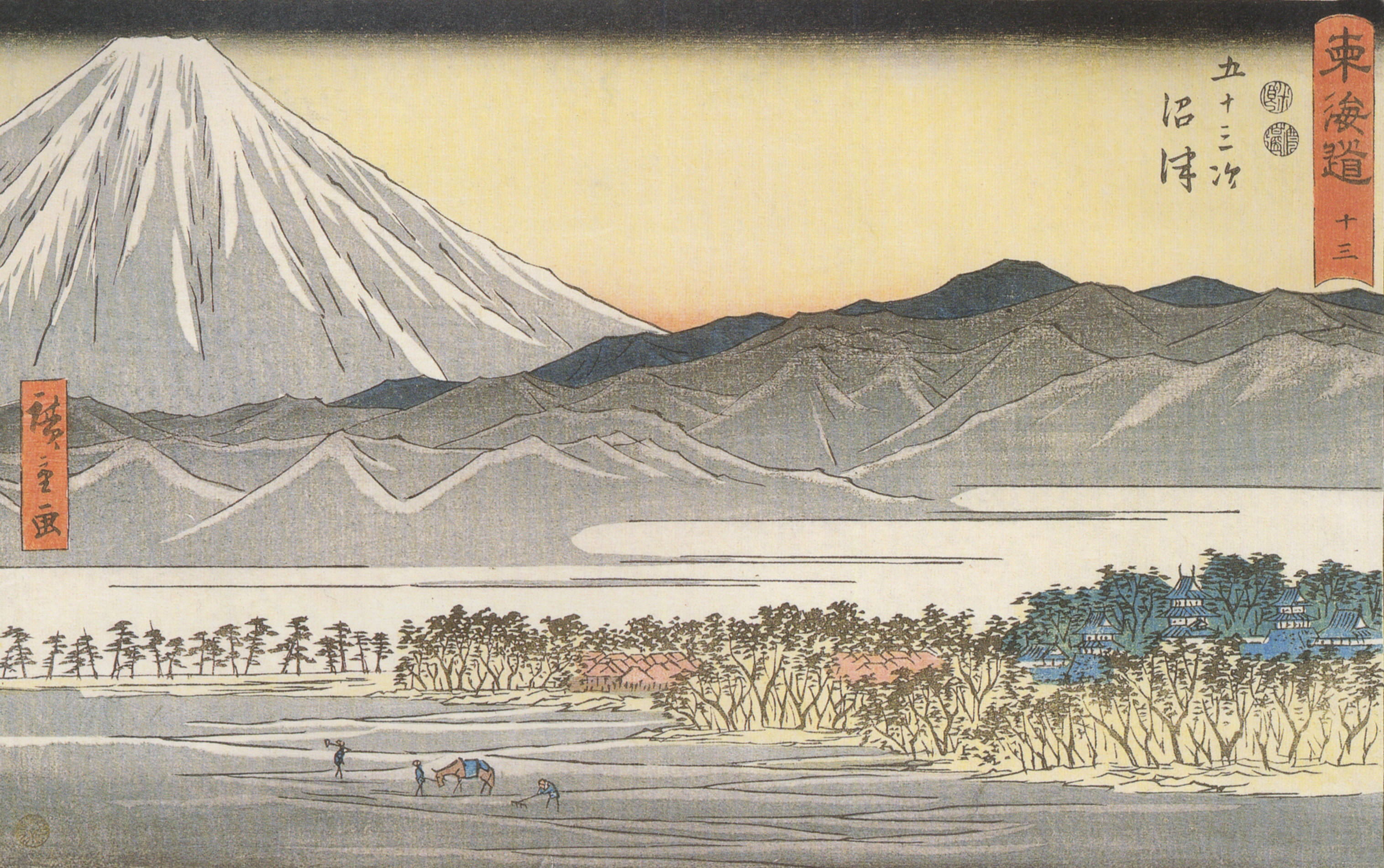
Capture with the sky. Often with the sky reflected in water, or with the sky asymmetrically related to a large element in the composition, such as a mountain or, as here, a tree. The effect is much like the famous Japanese prints of Mt Fuji, where a part of the mountain sits at one side of the frame, with one side trimmed to give a thrust into empty sky (and often, as below, with the distant view trimmed by the low plantings) ...

Capture with an eaves. Often used as the culmination of an entrance progressional, in which the psychological feeling of containment is instilled in the processional, then release is suddenly discovered, attained at the discovery of the open vista. The broad eaves trim the sky from the composition -- often parallel to a hedge as a trimming line (or here, at Fallingwater's guest house, trimmed by the walkway canopy leading to the main house below). The essence is the broad eaves thrusting out into the landscape, stressing the horizontal open vista.
Capture with a 'stone lantern.' The lantern itself is optional, but when faced with very simple scenery, with the foreground of a moderately complex garden, the link can be made by placing an object such as a stone lantern in the foreground, and also amidst the distant scenery -- due to the simplicity, the lantern stands out, and the two objects unite foreground and background. Look closely, and you'll see it ...

You will notice that
'capturing with a picture window' does not feature here, and with good reason: In Japanese garden design, this method is considered rather vulgar.
I hope this discussion of the elements of 'capturing a view alive' has been helpful.


;)
;)
;)
;)
;)
;)
;)
;)
;)
;)


 Why's that? Because unlike the modernist architecture of, say,
  "A simple rectangle in plan, the barn was planned so that unloading carts could pass through between the asymmetrically placed doors. The cowshed lies beneath the hayloft so that the cattle can be fed directly via a trapdoor.The intermediate floor slopes inward, both to facilitate spreading the hay and to guide rising breath of cattle to vents at the sides, reducing spread of infection. The framed structure allows a continuous window band at clerestorey level to maximise skylight, ventilation being achieved separately by flaps above. The pear-shaped plan gathers the cows around a food-floor which tapers with the quantity of food distributed, and the circulation space around the edge allows smooth flow. The guiding idea, though, was clearly to reflect the relationship between the 42 cows and the single bull, father of the herd and its genetic identity."