Wednesday, March 02, 2011

Temporary accommodation

Some of the best minds in New Zealand are now turning their minds to how to accommodate several thousand homeless Cantabrians.

The first thought, of course, is to throw up temporary accommodation around Christchurch as fast as possible. 

But as we know, “temporary” has a strange way of becoming permanent (such as the post-war prefabs build in South England to house the post-war homeless, some of which are still being enjoyed now as the equivalent of NZ’s beach baches), so the better minds are already realising that it is no point simply building in haste today the slums of tomorrow.

Better instead that whatever is put up swiftly today be future-proofed to be part of something better tomorrow.

Future-proofing this temporary accommodation means more than just thinking about making provision now for the new cabling and computer-driven systems that boffins will be inventing over coming decades.

It means thinking now about things like

  • the durability of materials and componentry (so what is built will last);
  • making these temporary units easily expandable into something greater (and building in now the capacity and flexibility to make this happen);
  • how the accommodation units are laid out (layouts that support the building of communities, with space between them for units to expand);
  • incentive schemes to encourage occupants of these units to eventually become owners;
  • making the units as simple to build as possible (which requires quite a bit of ingenuity in design) so that almost anyone can build and expand them (the more people capable of assembling them the more labour will be available to contribute to their rapid construction);
  • using as many “off-the-shelf” systems and components as possible to avoid delays in developing new prototypes;
  • and about designing the units as attractively as possible so that the good folk living in them will want to buy theirs.

The more future-proofed these units can be, the more permanent these “temporary” units can be made—which means the more “capital” in the form of air conditioning and security systems and the like can be installed; and the more infrastructure around them can be built—in the full knowledge that this investment of resources won’t be wasted down the track.

1101500703_400 Do it right, and it will be like building Levittown all over again (for which builder Bill Levitt earned that Time cover).

Or better.

Or at least as ingenious.

With that in mind, here’s just a few opening thoughts on the matter.

Designing in staged improvements

However these units are built, the more flexible their planning the better for the future.  Consider as an example of the sort of flexibility these simple cabins, which have been designed so that, come the time, something much grander may be made of them. (Coincidentally, the pictures come from an old remaindered book I bought second-hand from the Canterbury Public Library some years ago.)

Cabins001Cabin002 Cabin4Publication10  Now clearly I’m not suggesting just building a kitchen as the first stage of any temporary accommodation—what I’m suggesting here is a concept of how these buildings could be staged, with future modules easily added as and when needed.

Thinking about structural systems

One of the major question to be asked about these units is “where are they going to be built.” If you want to build around fifty to one-hundred units a weeks safely and economically, you’re really talking about building in factory conditions and then trucking either panels, house sections or whole houses out to sites to assemble and place on foundations.

Some years ago I worked at a yard in Perth doing just that for a house builder called Durabilt. The houses were built in the yard on lightweight pre-stressed concrete “bridge” sections that were supremely stiff, able to support long spans, and exactly the size of a truck deck.

A simple house might consist of two, three or more of these “decks,” on which the structure was framed up using lightweight steel stud framing with all joints spot welded together—which made it both light and very, very stiff.

A two-module house could be assembled in the yard by two carpenters in around 2.5 to 3 days, with all materials being delivered to them by forklift, and all other trades programmed in. The individual truck sections were then trucked to site and set upon six large concrete rings into which the foundations were poured, and all services connected.

Hey presto, four days after the concrete deck was deposited in front of two carpenters in the yard, it was all ready to move into somewhere in the Western Australian desert. Very quick, very simple, very inexpensive, very ingenious.

Here’s a few of my old photos to give you an idea of the system:

Publication3 A new one-module unit ready to go, with two new lightweight concrete “truck deck” bases in the foreground set up ready to build a two-module house.

Publication2 A look under the lightweight precast pre-stressed concrete transportable deck on which the new house is built, and which becomes its floor.
The brown strips are tape to help release the precast concrete unit from its form.
The ribs contain the prestressed wires that give the unit its stiffness and help reduce its weight.
Already existing systems like the Firth RibRaft system could easily be adapted to make these.
Note the limited number of supports needed (just six per “deck”) which means that foundations on site can be kept to a minimum.

Publication1Lightweight steel stud framing fixed and spot-welded together on two lightweight concrete decks.

Publication4  Cladding going up.

Publication5 A house pack of prefabricated steel door frames, made up to the required sizes, delivered from the yard’s central store and ready for almost instant installation.

Publication6 Door frames installed on the opening between the two modules—note the two walls, one on the perimeter of each concrete deck. 

Publication7A single module unit packed and loaded up ready to be transported off to its new location. The common wall between the new units is tarped up, and the onsite services and fittings needed onsite are being loaded up on the “goose neck.” (Foundation rings are still to be loaded). 

As you can see from these pictures, designing the simple houses around the lightweight concrete sections, using the module of a truck deck as the starting point, a very efficient construction system is possible.

Infrastructure

One issue bound to cause problems with any temporary accommodation is what to do about infrastructure, which will be the place where real “traffic jams” are almost bound to occur. 

Talking about real traffic jams writer Andrew Galambos talks about them as being a collision between capitalism and socialism, where capitalism can produce cars quicker than socialism can produce roads.

A similar problem might emerge with the provision of temporary accommodation, with capitalism able to produce and erect fare more housing units than the council can provide and repair the infrastructure to which they might need to be connected (given, especially, that it seems no part of the damaged infrastructure was insured, meaning all repairs and new construction must be paid out of existing capital) .

Fortunately, solutions exist.

Stringing new electricity cables is probably the simplest job to be overcome, and could be turned into a real aesthetic bonus by offering up the design of new poles and pylons (of which literally hundreds will be covering the landscape) to design competitions. The poles and pylons themselves can help symbolise recovery.

Getting new water mains to new sites is a little more difficult, but provision for this can be made in the reconstruction of exiting roads, and on-site use of rainwater and grey water should be considered to minimise water demand.

The greatest problem of infrastructure is how to get rid of waste water and storm water. Fortunately, solutions exist for this too. Instead of tapping into an already damaged centralised storm/wastewater system, with all the long delays associated with this, consideration could be given instead to onsite or decentralised disposal of waste and storm water (sometimes called “sustainable” disposal):

Decentralised StormSystem Doing this turns a problem into a solution.

Onsite wastewater disposal systems are now legion, both for individual houses and for small “hamlets” of houses.  These include sand filtration systems, evapo-transpiration systems, aerobic soakage beds, compensated dripper-line systems, wetland flow systems, and are very, very good—producing some delightful landscapes with the wastes themselves often used as compost and fertiliser.

WasteSystems(And their use would help encourage environmentalists who might otherwise object to these building developments to instead get in behind them, and to contribute their expertise.)

By installing evapotranspiration trenches as a means of wastewater disposal, for example, the wastewater from a house can be used to establish vegetation around a house, around a park, or across a field of edible plants like alfalfa.  And evapotranspiration trenches can be integrated with water harvesting swales and basins into designs to produce interesting landcape designs in a flat landscape, and to maximise food production, shade, shelter and dust mitigation.  (See here for example for their use in remote Australian communities.)

section It’s true that the Christchurch geology and landscape is not ideally suited to all these systems, but the expertise exists in New Zealand to select and design systems that would---and the land exists around the fringes of Christchurch to grow the crops produced.

Conclusion

There’s an awful lot more to be said, and these are just a very few initial thoughts about the  lines down which thinking might go in providing temporary accommodation around Christchurch. And I haven’t even begun talking yet  about the actual architectural design of the units themselves.

But that’s a post for another day.

Wednesday, November 10, 2010

Pakuranga Renovation – Organon Architecture

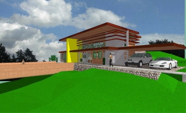
Boyes-Sketch_Plan_003-02 Here’s an interesting project I’ve been working on recently—renovation designs for an existing house in Pakuranga.Boyes-Sketch_Plan_003-Structure01 In essence, it involves the surgical insertion of a new steel and concrete upper floor over an existing one-storey, flat-roofed house (above), to add extra accommodation, and give a new double-height lounge (below).

Boyes-Sketch_Plan_003-Lounge It’s been fun to work on. And should be great to live in.

(Cross-posted at the Organon Architecture Blog)

Thursday, September 16, 2010

Architectural Mini-Tutorial: The Sociable Kitchen

Kitchens aren’t what they used to be—not that you’d know it from the antiseptic offerings in the trendy magazines and most of the kitchen showrooms. 

Kitchen are the place wherein the products of fire, light, earth and water are combined to become food; a place of experiment and sustenance.  In the modern house, the kitchen links family room, lounge dining room, breakfast space, BBQ area and more—and should open up to morning sun for breakfast, afternoon sun on the deck for barbecues, and mid-morning sun for coffee. Yet in this most  important space, where more money is spent per square metre than anywhere else in a house, “the kitchen industry - and kitchen designers - have to own up. The kitchens most people end up with look depressingly similar.” And dull.  And unable to really do what a kitchen should: support the essence of the kitchen

So let me tell you about a different kind of kitchen than you normally see: "The Sociable Kitchen." Not the place that Jona Lewie would always find himself in at parties, but somewhere in which you might be inspired to kick a party off.

Designer Johnny Grey talks about The Hardworking House, and he reckons in any house it’s the kitchen that’s the hardest-working room--especially with what he calls "The Sociable Kitchen."

sol_005tif-450x322

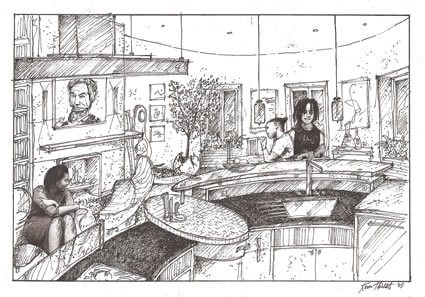
The Sociable Kitchen is a place like a combination of Great Hall and the Great Kitchens of yor, but much better equipped and more fun to be in. Not so much just a kitchen that you need to hide, as a living room in which you can cook, i.e., "open plan living environments that unite social, practical functions and the outdoors in one multi-functional hub." 

_Quote My belief [ says Grey] is that the kitchen is effectively a sociable space, its origins lie in the hearth; cooking and eating are largely group or family activities; when done alone they become purely functional and provide a somewhat incomplete experience that is better for being shared."

The Sociable Kitchens Grey has pioneered are places that are pleasant in which to cook, to hang out, and to pass through—even (you might say especially) in relatively narrow or constrained spaces. akd2190-10-dunster-441x450

Here, by way of example, are three designs by his students for a Sociable Kitchen at the Obama White House.

CLICK FOR DESIGN CLICK FOR THIS DESIGN CLICK FOR THIS DESIGN

Here’s another for a narrow three-metre space.

Jones01 Jones Kitchen 3 Jones Kitchen 2

Part of his method is that, rather than making "straight-line" kitchens that everyone will recognise as “the kitchen!”, he uses instead specialised pieces of furniture--often with curved or "soft" edges--each carefully located to perform a major kitchen function (e.g., storage, prep, serving, appliances) and linked to the scale of the space.  In a carefully designed kitchen (such as his own, in a remodelled garage), this might mean the preparation area might represent no more than 40 percent of the floor space--"the remainder being devoted to a comfortable and sociable lounging area... and integrated dining area, and a play space for our four children.  This," he says, "is typical of [our] recent divisions of kitchen space."

The concept involves something he sometimes calls “the unfitted kitchen,” especially suitable for spaces like the one shown here through which people will be moving to other related parts of the house.  Unfitted, today, means unrecognisable as a kitchen, allowing the sociability of the space to come to the fore. In Grey's designs these “unfitted kitchens” often involve a lot of curved elements (rather than straight) to reduce the visual presence of the units, and the presence of different units at different heights, from 700 right up to 950 (rather than continuous benchtops all at the same height) to help break up the normally monolithic kitchen furniture and invite people in.

By "people" he means guests as well as family. 

Using the popular Tripp Trapp chairs for children, for example, is one way to invite children in. 

And there are others.

The main thing is to embrace people rather than exclude them, something today’s traditional  straight-line fitted kitchens do poorly.

In a sociable kitchen you want lots of places to perch, and more work areas facing people than facing walls.  In the traditional galley  or U-shaped kitchens, however, this can be difficult, if not impossible.

Because as well as all the links to spaces beyond, the kitchen also needs to accommodate both the ideal work-flow of a main "inner" kitchen (i.e, storage -> prep -> sink -> cooker -> serving -> eating -> dirty dishes -> dishwashing -> crockery/cutlery storage) and the needs of the "outer" kitchen (e.g., snacks, sandwhiches, tea, coffee, cocktails) without either impinging on the other.

With Grey’s concept of the unfitted kitchen, the specialised pieces needed to do that can placed just right, needling less space and giving more delight than the normal "straight-line" kitchen layout.

As he says himself, "the science of marketing has taken over to a large extent when it comes to the design of our kitchens today," especially when it comes to the idea that size and straight-line continuous bench tops--made of the finest Italian marble--are the answer in today's kitchen.

But it doesn't have to be that way, says Gray at his blog.

_QuoteDuring the 1980s [and beyond], kitchens were created where you could not have conversations because the work surfaces faced the walls, showroom spaced, clad in plastic with shiny surfaces and matching doors. Domesticity was too old fashioned or simply too difficult to mass produce…
   
The focus [in designing kitchens] should be on creating spaces for living, eating, prepping and cooking. Instinct tells us everything we need to know. We want to be in a room because it feels like home.
   
A kitchen has simple needs: modest-sized, freestanding furniture pieces for each major function (like cooking, prepping and washing up), minimal countertops, a walk-in larder and a storage cupboard or two, a decent table, access to the outdoors and panoramic eye contact. And don’t forget about a place to make a mess, have a drink, chill out, experiment, and generally behave like you live there.
   
So throw out your matching units, continuous counters and matching doors with repetitive handles. You have nothing to loose but convention, and everything to gain. More space, less cost, more of you in the surroundings and less of being self consciously stylish, more playing with colour and use of vintage pieces. Enjoy discovering your inner interior designer.

And re-discovering even a tightly-constrained kitchen as a place to enjoy, rather than endure.

10013-Sketch02-Kitchen02-NW

Wednesday, August 11, 2010

Proposal for a family home in Howick

Sketch-ElevationN-26Glenfern-3pm

This is a proposal to renovate an existing three-bedroom house in the older part of Howick, with elevated views towards Beachlands, Rangitoto and Waiheke.

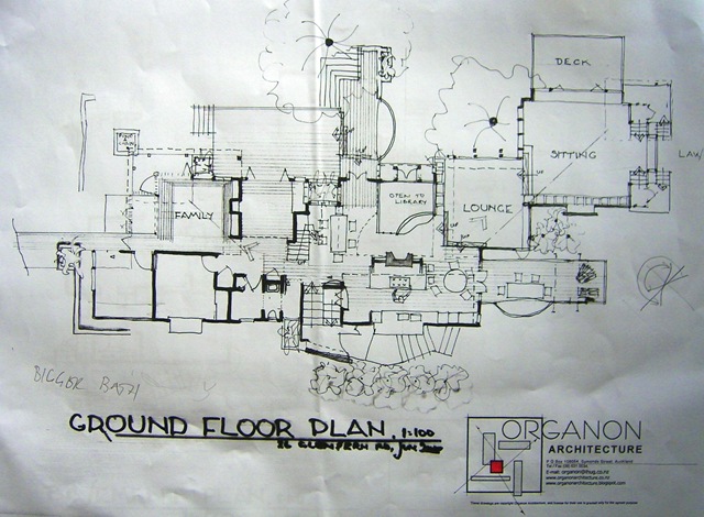
Sketch-Drive-26GlenfernIt’s designed as a “three-zoned house,” with parents’ realm upstairs and downstairs at the end with the view, children's realm at the  afternoon/garden end of the house, and the shared realm in between.

10013-Sketch-BasementPlan

The new spaces proposed for the house push the existing house out to views, to decks, to light and sun and gardens. The aim is an easy, informal, three-level family home within which the occupants may find adventure and delight—a house that is an extension of themselves -- connecting them to each other, to their grounds, and to the world beyond.

10013-Sketch-GroundPlan

10013-Sketch-FirstFloorPlan

10013-SketchPlan

Thursday, June 03, 2010

Megson House, 40 Fern Glen Rd North, St Heliers – Claude Megson

There was only one lecturer at either of the architecture schools I went to who was worth a damn. Sadly, he died in 1994 while I was away in London concocting a cunning plan to come back to Auckland and devise some way to work with him.  This was his house, which has just come on the market:

40FernGlennreshoot

From the Auckland Architecture Archive’s 'Megson in Auckland' guide:
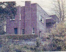
_quote Megson created this house [at 40 Fern Glen Rd] for himself and his wife Cherie by partially demolishing and building over a modernist brick house by architect Professor Richard Toy (right), a senior colleague of Megson’s at the School of Architecture. (Remarkably, the Megson’s had lived in Toy’s house for 15 years before commencing work). The site – a corner section located on the brow of a steep rise - is vertiginous, and Megson’s extensions further emphasized the vertical. Toy’s house became a brick base over which a new timber superstructure was placed. Fixed to the downhill façade, a series of balconies – cages of mesh and red-painted steel tube - project the spaces of the house out into the treetops.”
40FernGlenn004 A two-zoned house* with the kitchen acting as the “hinge” between the zones—a kitchen opening up to terraces and the sky, since Megson’s death in 1994, it has been bought and sold and renovated “utilising [says the estate agent now trying to sell it] the skill of a London-based architect and former student of Megson to ensure a reverential transformation.” For reverential, read “sterile.”
132468380_full Nonetheless, you can head to the agent’s site to see more pictures showing the house as it is now. 
132468362_full
Writing about Claude's house a few years ago, fellow-lecturer at Auckland’s Architecture School John Dickson said of it,
_quoteIt is impossible without the process of Megson's imagination to connect the cluster of small, confined rooms of the house as it was (right) to the expansive, multi-levelled, vertical-fissured, spatial-phantasm that it has become."
And English architectural critic Professor Geoffrey Broadbent, writing after a 1992 tour of Claude's Auckland houses had this to say:
_quoteThis," I said to myself, "is work of a very high international standard indeed." ...One is constantly struck by the surprise around the corner, the bright shaft of light penetrating from above into the softer glow of the main living spaces -- especially in Megson' own house – that give his work such very special qualities...
    “There is an essential "rightness" about Megson's spaces, for pleasant occupation by ordinary, normal human beings. Such things, says Dickson, have gone out of fashion with today's students. Well, so much the worse for the students [and their clients!].
    “Perhaps it hasn't occurred to them that if they design real spaces for human
comfort and pleasure, then even those anguished souls overwhelmed by post-Heideggerian problematics’ about the nature of their existence might, given spaces like Megson's to contemplate that nature of their ‘Being,’ come to more positive conclusions! Because that's the point about Megson's spaces; they are life-enhancing.”
Broadbent, for once, is exactly right; even if “the softer glow of the main living spaces” has now been transformed into something more stark, as below, you might still get a sense of what he meant.
132468374_full

Cross-posted at the Claude Megson Blog.

*Two-zoned house: A family home giving room and space to both parents and teenage children, with separate "parent's realm" and another realm -- either for children or for guests—which meet around kitchen and family areas.

Tuesday, May 04, 2010

1 architect, one 32sqm apartment, 24 different layouts!

The layouts include kitchen, library, laundry room, dressing room, a lounge with a hammock, a home theatre with big screen, an enclosed dining area, a bathroom (with tub) and a wet bar.

Each arrangement is made possibly by a perimeter containing a wealth of cunningly designed and easily transformed pieces of multi-use furniture, and a series of ‘moving walls’ slung from ceiling tracks, each with its own cunningly designed accoutrements, that slide across to redefine and remodel the space.

It’s astonishingly ingenious.

Head here to see plans and diagrams. and here to see architect Gary Chang’s presentation of his ‘tiny-yet-large’ Hong Kong apartment at a Tokyo Pecha Kucha event last year.

[PS: Thanks, Sandrine, for the heads up.]

NYT2009010914412754C

Monday, April 12, 2010

‘Wrightscapes’


taliesin_I_II_III_obra01

Frank Lloyd Wright maintained that the fundamental intention of good architecture, specifically of his “organic architecture,” was to make human life more natural and nature more humane. Clearly, that must begin with how your architecture is related to its surroundings, and vice versa.

To put it simply, the integration of site and architecture is paramount—and no-one has done that more successfully than Fran Lloyd Wright.

Charles & Berdeana Aguar’s exceptional book ‘Wrightscapes: Frank Lloyd Wright’s Landscape Designs’ looks at the spaces outside Wright’s magnificent houses, looking at the relationship between man-made and natural—between site and house. Because in every good design, neither can be understood without the other.

The Aguar’s offer this potent summary of the principles they identify as being identified with Wright’s landscapes—and I say “potent” because they identify principles worth applying to every house that attempts that goal, not just a Wright-designed one:

“Wrightscapes” Defined

    The eventual success of a cultivated environment is not merely the result of plants or structures upon the landscape, but rather the sum of both the tangible and intangible—that is, the unification of the substantive elements upon the site with the personalities and experiences of those who visit or reside in the total environment that has been created.
    Thus, this environment ultimately becomes both a literal and a sensual experience of the pervading essence—or spirit—of the place.  The amalgamation of criteria that creates this spirit-of-place should be, to a greater or lesser degree, inherent in each property…

  1. The residence was designed to meet the needs of a specific client and site, or was designed as a [speculative] home, and Wright or his representative personally provide input as to siting.
  2. The residence was orientated to take advantage of natural factors inherent to the site: optimum solar exposure, prevailing winds, views, natural terrain, existing trees, and other vegetation.
  3. The architecture and landscape treatment are responsive to and “at one” with the site—that is, there is a perceived (if not actual) interrelationship with the Nature of the site.
  4. The natural landscape has been preserved, or the structure and plantings present a total composition that follows the fundamental design elements of unity, harmony, scale, simplicity, colour, form and texture.
  5. The hardscape—outdoor furniture and construction, such as walls, paving material, water features, paths, parking areas—is in harmony with and suitable for the architecture.
  6. The softscape—plant material—is appropriate to the site and has been retained in a natural form…
  7. Extensions of architecture into the Nature of the site—balconies, verandahs, open porches, and outdoor rooms—have been retained to respect , or adapted to complement, Wright’s original design intent with respect to indoor-outdoor relationships.
  8. The passage of entry from property line to front door provides an experience in itself—and entry experience—with exposure to unifying and/or contrasting textures of both built and natural materials.
  9. There is a “sensed” experience of the total environment—a sense of place—that transcends bui8lding and plant materials, no only in what is seen, but in what is perceived: the feel of textures underfoot and of intermittent coolness and warmth to the skin; moving out from the shade and into the sun; the smell of flowers, grass, fruit, or any scents vivified by rain or air; the sounds of crunching gravel, singing and chirping birds, or splashing water; and other sensory qualities.

In other words, everything that can be done to put the occupants of the architecture into possession of their earth, and to remind them why life on this earth is worth living.

The pictures, by the way, are of the landscape around Wright’s own home in Wisconsin, Taliesin East.


taliesineast02

taliesineast05taliesineast06

Wednesday, December 09, 2009

Now THIS is what I call a holiday house ...


4pm Summer

Plan - Ground FloorSomeone emailed me in support of John Key's bach.  Well, of what John Key and a journalist claim is a bach. 

They reckon it's a beaut bach, just as John Boy obviously does.

Well, I don't.  I know what baches should look like. 

Here's one here.  Yes, I've posted it here before, but here's my own favourite unbuilt bach.  Relaxed.  Casual.  Open.  Expansive.  And yes, it's one I designed
myself.   Let's call it Holiday House 1. (Click on pics to enlarge.)

SectionsUPDATE:  The pictures above show the house in mid-summer, in mid- to late-afternoon, when shade is your friend and the large eaves do their work. 

Here's a picture of the house at the same time of day in mid-winter, showing the penetration of the sun at the time when it's most wanted:

4pm Winter

Labels: Architecture