Showing posts with label Kitchens. Show all posts

Wednesday, March 26, 2025

ARCHITECTURAL MINI-TUTORIAL: Soft Geometry

Here's a very simple principle to bring into your kitchen: corners can hurt.

Ouch!

The solution is simple: something called Soft Geometry, instead of hard.


‘Soft Geometry’ is a technique used by kitchen designer Johnny Grey
Grey's experience with the Alexander Technique led him to study how body movement is affected by peripheral vision, which, surprisingly, turns out to be another source of muscle tension. When your eyes sense sharp corners on the edge of your path, they activate a stress response to ensure that you avoid hitting anything. This makes you more tense.

To counteract this and make the time spent in the kitchen more relaxing, Grey developed what he calls "soft geometry." His counters have round edges; his islands and the cabinetry below them are circular or elliptically shaped, while the counters and cabinetry opposite them are often concave. He also likes free-standing, floor-to-ceiling cylinder-shaped cabinets for storing large pots and pans. All these unusual shapes make the space feel more playful, which is also relaxing.

The unusual shapes would seem to require a bigger area for a kitchen, but Grey said the opposite is true. With a concave-shaped kitchen, you can get more cabinets and appliances into a smaller space, while freeing up more floor area so that two or more people can work at the same time.
Inspired by the relationship between peripheral vision and body movement, he argues that "people flow like water around obstacles in a space." So "by rounding the edges of the furniture, you make the kitchen friendlier to use." It's a happy space.
I want to make environments that make you feel good, that foster well-being [says Grey]. I started working with neuroscientists eight years ago – in particular John Zeisel – which validated a lot of the things I’d been doing with emotionally intelligent design. I also wanted to apply the science of happiness to kitchens , which was inspired by Sir Richard Layard’s book, 'Happiness: Lessons from a New Science.' He noted people were happiest between 5-9pm when they are either in the pub or their kitchen. So the question for the kitchen designer is, how do we enhance that? 

We need to have a central island where the hob is placed so the cook can face the room with a raised height bar for food serving and for leaning against. Visitors can then sit or perch and chat with the cook who can keep eye contact with the entire room. You need also different level work surfaces for small children and secondary work stations and plenty of table space so that lots of different activities can take place simultaneously.
And it starts with those curves. It could be something as simple as rounding the corners on a straight island bench, to remove the feeling of hazard. Or it could be a whole island is made elliptical.
His suggestion to make that eye contact easier is a central island in the kitchen, but one with curved corners, rather than angles and sharp edges.

"Anything that is in your peripheral vision demands more brain action. And something that is sharp can cause anxiety, however subliminal, because we are aware it's something we should avoid bumping into, as it could hurt.

"There's a practical benefit, too, because by using rounded corners for furniture you can take less space for walk-through areas.

Movements will be more relaxed, as subconsciously you won't feel the need to allow more room as you pass fittings."

While acres of counter space may look impressive, it's not what we need emotionally, says Grey, who believes we are more relaxed when we have less choice and more compact spaces to work within.
When working in a kitchen our eyes and focus are on the work, and on the people around us. Rounding off our corners removes the feeling of hazard in our periphery— and so keeps our eyes where they should be: on our food, and on our friends and family. 

It's all about maintaining focus on what's important. "Eye contact as key to design was another neuroscience-inspired idea,  alongside the identification of each kitchen's 'sweet spot' as the location for a key piece of furniture such as the central island."

This design technique "eliminates sharp corners and makes for a more relaxed way of negotiating an island in the middle of a room." The soft geometry "encourages everyone to linger in this space. People lean against these curves."


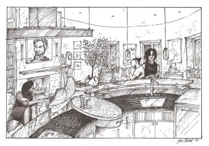
Grey's bespoke curved benchtops often call for curved cabinets. It's here where much of the expense lies. But you can bring in curves easily enough with a curved benchtop and "conventional" 600mm rectangular cabinetry (cabinets drawn below with dashed lines). ...


... or something more ...


Thursday, July 20, 2023

"The Need for Therapeutic Architecture in Today’s Society"


"With the rise in mental illness there is an increasingly strong need for therapeutic spaces," writes architect Abigail Freed. "Therapeutic architecture," she argues "lessens the need for the typical patient-doctor relationship. The space itself becomes the 'therapeutic apparatus'."

What a fascinating idea!

I've been told by some clients that our initial design interview is "a little like psycho-analysis." Architect Richard Neutra, a friend of Sigmund Freud, made that connection explicit. Explains Freed:
He required his clients to keep diaries and subjected them to a lengthy interview process. These tactics were Neutra’s way of gaining insight into their daily lives, their conscious and unconscious desire, their habits, their personal and interpersonal struggles and triumphs, as well as their deepest thoughts and feelings. Neutra believed that “architecture should operate like psychotherapy by assisting clients to satisfy unconscious psychical desires” and that the architect “operates on the basis of an emotional dynamic with a client developed through analysis of childhood experience.” From this process he felt fully equipped to create a physiologically curative design.”

 Bethany Morse outlines his four-fold "biorealist" approach:

Abigail Freed outlines some of the "design tactics" Neutra used to fulfil the brief he gave himself, to better connect the "subject" to their environment and "imprint" upon them better mental habits.

One of the most notable features “of Neutra’s work during the 1950’s was an intense concentration on dismantling conventional barriers between inside and out.” He achieved this effect through the implementation of various tactics such as transparent glass, “spider legs” and mitred glass corners.
    In all of Neutra’s post war houses there is an emphasis on the glass exterior.

    In the Rourke house (1949) “the outside world intrudes through large glass panels. These are not simply picture windows that frame views or glass walls that structure the house as in traditional… instead the glass window/wall is actually a door that moves and permits movement. The wide overhang of the roof creates a zone of shadow attenuating and extending the boundary of the interior. The overhangs that all but eliminate reflection further reinforce the indeterminate simultaneity of enclosure and exposure. The glass becomes not transparent but invisible to leave the house unbounded.”


    Neutra used his Spider Legs (pictured above) “to collapse the normally primary architectural distinction between exteriority and interiority”. The spider leg is a single beam or fascia that “fascia stretches far beyond the edge of the roof at a major corner and turns down the reach the ground”. By displacing the corners of rooms and “in some cases the very structure of the house such normally stabilising architectural elements are indeterminately inside and outside at the same time.”


One of the most celebrated features of his architecture is the corner where one glass plane meets the other. At this corner the floor to ceiling glass meets at a mitred edge to produce a glazed environment of intense spatial ambiguity. Here there is a distinct oscillation between opacity and transparency, interiority and exteriority, solidity and fluidity and it generates perceptual confusion. Here the “glass and frame perform to both produce and suppress the edge of the house.” In the Moore House (1952) “the corner provided [Mrs. Moore] with a sense of the inter-relation of Nature without and living within that could do nothing less than eliminate the depression which we feel. She felt this interrelationship especially on a misty gloomy day, in other words when the house was at its most moody and when she turned to the window to get out, to enter its distant view over the far landscape and to join what she called the ‘mystery over the mountains’.” Neutra saw this corner as the precise moment where instabilities and uncertainties collect and where desires, both psychic and organic are projected.  

Our human psychology, Neutra recognised, comes from our human birthplace of "the primeval forest or the grassland of prairie and pampas," but has now become 90% man-made. Nonetheless, we still feel most comfortable in places that replicate the patterns of our ancient birthplaces.  One of the most potent is that of "prospect and refuge." As Barbara Lamprecht explains,
“prospect,” meaning looking out above your surroundings from a commanding position … afforded by glass walls. In contrast, the kitchen and the bedroom/dressing area, with their walls of warm mahogany, create the counterweight to prospect in the quality called “refuge,” or shelter, or what Gaston Bachelard called the cave. Both prospect and refuge are necessary to us.

Bothe qualities, of course, would have been physically necessary when subject to potential attack by wild animals, or other humans! Now they are just as necessary psychically. 

Those manipulations of corners, opening them up in contrast to a deep and sheltering corner opposite, is just one of the patterns Neutra built into his houses that recognised this deep psychological need. And this strong contrast between the deep sheltering "cave" set off against the opportunities for prospect made the whole space appear larger, and more active.
Neutra delivered a small space that feels expansive, not cramped, because it has an effect beyond its four walls. As he often said, his goal with small houses was to “stretch space” ...
So how well did all this work in practice? Freed summarises it as seeing its success from the few failures:
One of his clients, Mrs. Logar, wrote to Neutra in 1956 (just four years after building the home in Granada Hills California) saying that she and her husband wished to sell their house. She states, “it looks messy all the time and there is no place to hide things away. We are entirely exposed to view from all sides. This is just about right for some executive and his wife. I think I prefer to live in an old hidden away place for a couple of years to clear my thoughts.”Mrs. Logar was exhibiting one of the common criticisms of Neutra’s homes: the feeling of vulnerability and extreme exposure that accompanied living in the glass house.
    However this complaint is the home’s very success, not failure. Based on the Freudian understanding of empathy, which is defined as “an unconscious defense against internal impulses… to projection onto an inanimate object… into a defensive transfer of feelings onto another subject” it can be inferred that those who are experiencing these fears of exposure and vulnerability are actually experiencing their unconscious repressions becoming conscious. In the Freudian manner Neutra has brought to light what they have repressed since childhood- their fear of exposure and vulnerability- in order to overcome these fears and be cured of their neurosis.
    Mrs. Rourke, contrary to Mrs. Logar’s opinion, “argued that Neutra had given them a new living experience [and she] could think of only one word to describe the way she felt about it: Liberation.”While Mrs. Logar failed to overcome her phobia, Mrs. Rourke’s statement suggests that she was able to embrace the vulnerability tied to exposure from all sides at all times and was rewarded with a improved quality of life. The “improperly bounded environments of these houses permitted psychoanalysis to be everywhere and nowhere at the same time. The houses’ naturalising materials, blurred structure, and camouflaged glass are both in the open and deliberately evade the gaze, enabling their therapeutic actions to be everywhere while out of view.”
Understanding a building's enclosure in terms of patterns like "connecting with nature" and "prospect and refuge" allows us to understand how we can shape our houses today to meet the psychological needs of today's inhabitants. As Abigail Freed concludes:
This type of architecture is always a success if it at the very least helps those struggling feel as through they are helped. What is the harm if it relieves only the inner anxieties of some? Critics may claim it is “all in their head”, but that is the very basis of emotion -- we all exist in our own heads.
Agree or not, perhaps the most important thing to take away is that our psychological facts and requirements are just as important to the design of our houses as our physiological needs, or the house's structural demands. They are all facts of existence that we must take into account in our designs.

When we do, successfully, they can be a curative.


Tuesday, August 01, 2017

Recent Project: New kitchen in home renovation


The wonderful kitchen designer with whom I often work, Leonie Von Sturmer, is far better at self-promotion than I am — and here (above) on the front cover of the latest Trends magazine is the new house and kitchen we recently worked on at Greenwood’s Corner, Auckland.

With its new roof carefully located to manouvre through council’s height-in-relation-to-boundary controls, I love the way you can relax at the kitchen counter with a beer, enjoying the birdlife and foliage of the surrounding trees through the glassed gables and dormers.

(If I say so myself), it makes for a surprisingly open and informal setting in a relatively constrained site.
.

Thursday, February 04, 2016

Architecture: Making ‘a home for man.’ Part 3: The essence of the home


“Whatever space and time mean, place and occasion mean more. For space in the
image of man is place, and time in the image of man is occasion. ... We are not
building buildings, we are building ritual, building occasion, building life itself.”
~ Claude Megson (after Aldo Van Eyck)

Over the last two days we talked about man and how to begin making a home for him on this earth: It’s not just about marking a spot; it’s about making places: human places, for human occasions.

But isn’t it the case that much of our built environment, and hence much of what architects do, is normally beyond our immediate awareness? Most people just don’t notice too much about the buildings they’re in, do they (at least not consciously) – they quickly become ‘second nature’ to us, unless of course something goes wrong!

We might ‘feel’ a space or a building as being good or bad or uplifting or stultifying or bland or glorious … but we don’t always consciously know why. So let’s start looking at what architecture is trying to say to you, and how you can begin to ‘listen.’  And let’s literally start in the home . . .

Part 3: The essence of the home

“A house is not an object but a universe we construct
for ourselves – not a garage where we park ourselves.”
 
~
Claude Megson

SINCE WE TEND TO take for granted the architectural experiences we are offered, so Jay Farbstein and Min Kantrowitz in their book People in Places suggest a starting point for learning to understand what architecture can say to you if you let it (assuming of course that the architecture has something to say!):

Architecture [they say] begins with the five senses, plus other (sub-senses) like those to do with temperature, humidity, air movement across the skin, and especially the kinaesthetic or haptic; the senses must come first!

Next, These sensations must be integrated into patterns i) of day-to day life – entering the house, engaging in conversation, cooking, eating, watching television, bathing, lying in bed – and ii)of integration with the wider world with the perceiver at the centre – detailed and complex recognition of siting, eye lines into the distant ( and close) landscape.

Of harbour, valley and hilltop (each with their own resonance for us) and even the gradual exclusion of the public realm (“this is our space”) down to individual realms (“this is my space”).

Architecture recognises and builds in all these patterns or rituals – try and identify them in the place you’re in now, and think too about that special place from childhood and see how its patterns go together, and if they played some part in making it special for you.

The point here is that all architecture begins with you – it doesn’t begin with some gods-eye view from above, or from some arid analysis of string-courses and pendentives. It starts from the point of view of the observer, of the person experiencing the whole ensemble---it starts there, and it radiates out1.

From this starting point then, architecture needs to integrate the material sensed (nothing should be accidental in art), and integrate it conceptually into a pattern that gives to the person experiencing it a meaning to life on this earth. It should be life-enhancing, on a distinctively human scale, because, as we’ve said, architecture is about making a home for man ­ - literally MAKING a home for man – and at the same time EXPRESSING the facts about our world and our place in it, and then underscoring whatever emotional evaluation follows from that.

* * *

Sometimes the house grows and spreads so that, in order to live in it, greater elasticity of daydreaming, a
daydream that is less clearly outlined, are needed. "My house," writes Georges Spyridaki, "is diaphanous,
but it is not of glass. It is more the nature of vapour. Its walls contract and expand as I desire. At times,
I draw them close about me like protective armour .. But at others, I let the walls of my house blossom
out in their own space, which is infinitely extensible.” Spyridaki's house breathes. First it is a coat of armor,
then it extends ad infinitum, which amounts to saying that we live in it in alternate security and adventure.
It is both cell and world. Here geometry is transcended.
 
~ Gaston Bachelard, The Poetics of Space

AS WE’VE SEEN in Part Two of our story, the essential meaning -- the very essence of the dining occasion-- is celebration. Giving to a home this essential human meaning of celebration is what we’re doing when we build a space for dining (or, if we’re not very good, we build something that might give almost the opposite impression).

Thus, the essential meaning given to the dining space of a home should be celebration.

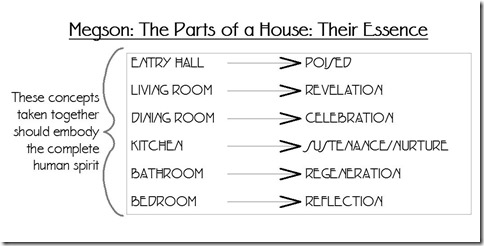
In the same way, architect Claude Megson suggested that every space in a home has its own essential human meaning that must be given its essential place and expressed appropriately in the architecture (and in the following outline I use Megson’s schema). When we build a house, in the words of Megson “we build a whole universe for ourselves to inhabit” – that place must reflect our whole universe of needs and emotions. The universe of our own soul. So let’s take a tour round our ‘soul,’ and the essence of all that it contains.

If our Dining area isn’t just a place in which to gnaw on a raw bone, then the Bathroom isn’t just a place to hose ourselves down. It is, or should be, a place wherein we experience our physical selves (visuall via our mirrors) and receive our full physical sensation of being; a place in which to cleanse and refresh ourselves both physically and spiritually (it’s no accident that religionists adopted bathing as a symbol of baptism.) It should express, if we can manage it, a feeling of cleansing and rejuvenation -- almost of rebirth.2 The term used by Megson was “Regeneration.” That, oddly enough, is the feeling a good bathroom should give.

Just to clarify here: A good bathroom, or indeed any space designed and built properly, should both support the function intended for that space, and at the same time express the meaning -- the essence – of the space. Both feeling and function are equally important – indeed, the feeling is an integral part of the function that needs to be built into the form I f form and function are realy going to be made one. (And as Frank Lloyd Wright said on a somewhat related subject, if done properly “form and feeling become one.”)

So Dining = Celebration; Bathroom = Regeneration. What else needs to be expressed in Megson’s schema?

Our Living Room is the place where life reveals itself; wherein a stage is set for our lives, for all our entrances and exits; a place of both continuity and permanence; both adventure and security; a place for books, for relaxation, for discourse, for the good news and the disappointments of our lives; for the gatherings and the adventures and occasional withdrawing from the world we all do and need to do .. the place wherein the nature of our selves is worked out and revealed, with all the other spaces in the house acting as support.

And like a stage (and like our own private souls) the Living Room both exposes and hides us: as Gaston Bachelard explains the house should sometimes be around us like an armour, like a cloak, and at others it should hardly be there at all.

Most of all, a living room should express the adventure of life. All these things described in the living space reveal the nature of a full life, so the living room as a who;e shows us the whole cosmos of life. If dining is a mark in time, then our living rooms should reveal a sense of the infinite. So a Living Room worth its name must both support the function of lounging, and at the same time it should, Megson argues, express the concept of Revelation. That concept, he argues, best describes the human need fulfilled in our best Living Rooms. In this place, more than in any other part of the house, this concept should be most evident.

The Entrance: Here is our hinge, our place of welcome and farewell, the place in which we are midway between coming and going, where we are poised “cat-like” between entrance and exit, between rejection and welcome … a dynamic equilibrium representing the occasion of greeting; the concept best expressed here is Poise.

The Bedroom is our ultimate place of withdrawal; our place for solace and sexual excitement, for peace and repose, and for reflecting, planning and dreaming. Bedroom = Reflection.

The Kitchen is the place in which life is sustained and nurtured; in which the first lessons are learned of chemistry and physics; of safety and danger. The essence of the Kitchen is Sustenance, or Nurture.

All these functions and feelings and meanings take place under one roof, in one house. In the same sense that all artwork is making a statement about the world in which we live – whether the artist likes it or not -- every piece of art is a microcosm of what the artist considers to be fundamentally important within this universe – so too the house should contain a whole universe in microcosm.
HouseEssence

In Megson’s words, the house is not just a garage where we park ourselves; nor is it merely an object: it is instead a whole universe we construct for ourselves -- “it should embody the complete human spirit.”

This is how we go about our task, of making a home for for man . . .


NOTES

1. A point to anyone who can see the similarity to Austrian economics, or to Montessori education.
2. We cleanse ourselves of ‘the outside’ while symbolically cleaning ourselves within; we emerge physically revitalised and metaphorically reborn. (It is no accident that bathing is the essential religious symbol of baptism.)
    Water represents purity; as does its complement, light; which together produce an essential sparkling, uplifting effect.

[Cross-posted to the Claude Megson Blog]

Thursday, September 16, 2010

Architectural Mini-Tutorial: The Sociable Kitchen

Kitchens aren’t what they used to be—not that you’d know it from the antiseptic offerings in the trendy magazines and most of the kitchen showrooms. 

Kitchen are the place wherein the products of fire, light, earth and water are combined to become food; a place of experiment and sustenance.  In the modern house, the kitchen links family room, lounge dining room, breakfast space, BBQ area and more—and should open up to morning sun for breakfast, afternoon sun on the deck for barbecues, and mid-morning sun for coffee. Yet in this most  important space, where more money is spent per square metre than anywhere else in a house, “the kitchen industry - and kitchen designers - have to own up. The kitchens most people end up with look depressingly similar.” And dull.  And unable to really do what a kitchen should: support the essence of the kitchen

So let me tell you about a different kind of kitchen than you normally see: "The Sociable Kitchen." Not the place that Jona Lewie would always find himself in at parties, but somewhere in which you might be inspired to kick a party off.

Designer Johnny Grey talks about The Hardworking House, and he reckons in any house it’s the kitchen that’s the hardest-working room--especially with what he calls "The Sociable Kitchen."

sol_005tif-450x322

The Sociable Kitchen is a place like a combination of Great Hall and the Great Kitchens of yor, but much better equipped and more fun to be in. Not so much just a kitchen that you need to hide, as a living room in which you can cook, i.e., "open plan living environments that unite social, practical functions and the outdoors in one multi-functional hub." 

_Quote My belief [ says Grey] is that the kitchen is effectively a sociable space, its origins lie in the hearth; cooking and eating are largely group or family activities; when done alone they become purely functional and provide a somewhat incomplete experience that is better for being shared."

The Sociable Kitchens Grey has pioneered are places that are pleasant in which to cook, to hang out, and to pass through—even (you might say especially) in relatively narrow or constrained spaces. akd2190-10-dunster-441x450

Here, by way of example, are three designs by his students for a Sociable Kitchen at the Obama White House.

CLICK FOR DESIGN CLICK FOR THIS DESIGN CLICK FOR THIS DESIGN

Here’s another for a narrow three-metre space.

Jones01 Jones Kitchen 3 Jones Kitchen 2

Part of his method is that, rather than making "straight-line" kitchens that everyone will recognise as “the kitchen!”, he uses instead specialised pieces of furniture--often with curved or "soft" edges--each carefully located to perform a major kitchen function (e.g., storage, prep, serving, appliances) and linked to the scale of the space.  In a carefully designed kitchen (such as his own, in a remodelled garage), this might mean the preparation area might represent no more than 40 percent of the floor space--"the remainder being devoted to a comfortable and sociable lounging area... and integrated dining area, and a play space for our four children.  This," he says, "is typical of [our] recent divisions of kitchen space."

The concept involves something he sometimes calls “the unfitted kitchen,” especially suitable for spaces like the one shown here through which people will be moving to other related parts of the house.  Unfitted, today, means unrecognisable as a kitchen, allowing the sociability of the space to come to the fore. In Grey's designs these “unfitted kitchens” often involve a lot of curved elements (rather than straight) to reduce the visual presence of the units, and the presence of different units at different heights, from 700 right up to 950 (rather than continuous benchtops all at the same height) to help break up the normally monolithic kitchen furniture and invite people in.

By "people" he means guests as well as family. 

Using the popular Tripp Trapp chairs for children, for example, is one way to invite children in. 

And there are others.

The main thing is to embrace people rather than exclude them, something today’s traditional  straight-line fitted kitchens do poorly.

In a sociable kitchen you want lots of places to perch, and more work areas facing people than facing walls.  In the traditional galley  or U-shaped kitchens, however, this can be difficult, if not impossible.

Because as well as all the links to spaces beyond, the kitchen also needs to accommodate both the ideal work-flow of a main "inner" kitchen (i.e, storage -> prep -> sink -> cooker -> serving -> eating -> dirty dishes -> dishwashing -> crockery/cutlery storage) and the needs of the "outer" kitchen (e.g., snacks, sandwhiches, tea, coffee, cocktails) without either impinging on the other.

With Grey’s concept of the unfitted kitchen, the specialised pieces needed to do that can placed just right, needling less space and giving more delight than the normal "straight-line" kitchen layout.

As he says himself, "the science of marketing has taken over to a large extent when it comes to the design of our kitchens today," especially when it comes to the idea that size and straight-line continuous bench tops--made of the finest Italian marble--are the answer in today's kitchen.

But it doesn't have to be that way, says Gray at his blog.

_QuoteDuring the 1980s [and beyond], kitchens were created where you could not have conversations because the work surfaces faced the walls, showroom spaced, clad in plastic with shiny surfaces and matching doors. Domesticity was too old fashioned or simply too difficult to mass produce…
   
The focus [in designing kitchens] should be on creating spaces for living, eating, prepping and cooking. Instinct tells us everything we need to know. We want to be in a room because it feels like home.
   
A kitchen has simple needs: modest-sized, freestanding furniture pieces for each major function (like cooking, prepping and washing up), minimal countertops, a walk-in larder and a storage cupboard or two, a decent table, access to the outdoors and panoramic eye contact. And don’t forget about a place to make a mess, have a drink, chill out, experiment, and generally behave like you live there.
   
So throw out your matching units, continuous counters and matching doors with repetitive handles. You have nothing to loose but convention, and everything to gain. More space, less cost, more of you in the surroundings and less of being self consciously stylish, more playing with colour and use of vintage pieces. Enjoy discovering your inner interior designer.

And re-discovering even a tightly-constrained kitchen as a place to enjoy, rather than endure.

10013-Sketch02-Kitchen02-NW

Tuesday, May 04, 2010

1 architect, one 32sqm apartment, 24 different layouts!

The layouts include kitchen, library, laundry room, dressing room, a lounge with a hammock, a home theatre with big screen, an enclosed dining area, a bathroom (with tub) and a wet bar.

Each arrangement is made possibly by a perimeter containing a wealth of cunningly designed and easily transformed pieces of multi-use furniture, and a series of ‘moving walls’ slung from ceiling tracks, each with its own cunningly designed accoutrements, that slide across to redefine and remodel the space.

It’s astonishingly ingenious.

Head here to see plans and diagrams. and here to see architect Gary Chang’s presentation of his ‘tiny-yet-large’ Hong Kong apartment at a Tokyo Pecha Kucha event last year.

[PS: Thanks, Sandrine, for the heads up.]

NYT2009010914412754C