Tuesday, May 04, 2010

1 architect, one 32sqm apartment, 24 different layouts!

The layouts include kitchen, library, laundry room, dressing room, a lounge with a hammock, a home theatre with big screen, an enclosed dining area, a bathroom (with tub) and a wet bar.

Each arrangement is made possibly by a perimeter containing a wealth of cunningly designed and easily transformed pieces of multi-use furniture, and a series of ‘moving walls’ slung from ceiling tracks, each with its own cunningly designed accoutrements, that slide across to redefine and remodel the space.

It’s astonishingly ingenious.

Head here to see plans and diagrams. and here to see architect Gary Chang’s presentation of his ‘tiny-yet-large’ Hong Kong apartment at a Tokyo Pecha Kucha event last year.

[PS: Thanks, Sandrine, for the heads up.]

NYT2009010914412754C

Monday, April 12, 2010

‘Wrightscapes’


taliesin_I_II_III_obra01

Frank Lloyd Wright maintained that the fundamental intention of good architecture, specifically of his “organic architecture,” was to make human life more natural and nature more humane. Clearly, that must begin with how your architecture is related to its surroundings, and vice versa.

To put it simply, the integration of site and architecture is paramount—and no-one has done that more successfully than Fran Lloyd Wright.

Charles & Berdeana Aguar’s exceptional book ‘Wrightscapes: Frank Lloyd Wright’s Landscape Designs’ looks at the spaces outside Wright’s magnificent houses, looking at the relationship between man-made and natural—between site and house. Because in every good design, neither can be understood without the other.

The Aguar’s offer this potent summary of the principles they identify as being identified with Wright’s landscapes—and I say “potent” because they identify principles worth applying to every house that attempts that goal, not just a Wright-designed one:

“Wrightscapes” Defined

    The eventual success of a cultivated environment is not merely the result of plants or structures upon the landscape, but rather the sum of both the tangible and intangible—that is, the unification of the substantive elements upon the site with the personalities and experiences of those who visit or reside in the total environment that has been created.
    Thus, this environment ultimately becomes both a literal and a sensual experience of the pervading essence—or spirit—of the place.  The amalgamation of criteria that creates this spirit-of-place should be, to a greater or lesser degree, inherent in each property…

  1. The residence was designed to meet the needs of a specific client and site, or was designed as a [speculative] home, and Wright or his representative personally provide input as to siting.
  2. The residence was orientated to take advantage of natural factors inherent to the site: optimum solar exposure, prevailing winds, views, natural terrain, existing trees, and other vegetation.
  3. The architecture and landscape treatment are responsive to and “at one” with the site—that is, there is a perceived (if not actual) interrelationship with the Nature of the site.
  4. The natural landscape has been preserved, or the structure and plantings present a total composition that follows the fundamental design elements of unity, harmony, scale, simplicity, colour, form and texture.
  5. The hardscape—outdoor furniture and construction, such as walls, paving material, water features, paths, parking areas—is in harmony with and suitable for the architecture.
  6. The softscape—plant material—is appropriate to the site and has been retained in a natural form…
  7. Extensions of architecture into the Nature of the site—balconies, verandahs, open porches, and outdoor rooms—have been retained to respect , or adapted to complement, Wright’s original design intent with respect to indoor-outdoor relationships.
  8. The passage of entry from property line to front door provides an experience in itself—and entry experience—with exposure to unifying and/or contrasting textures of both built and natural materials.
  9. There is a “sensed” experience of the total environment—a sense of place—that transcends bui8lding and plant materials, no only in what is seen, but in what is perceived: the feel of textures underfoot and of intermittent coolness and warmth to the skin; moving out from the shade and into the sun; the smell of flowers, grass, fruit, or any scents vivified by rain or air; the sounds of crunching gravel, singing and chirping birds, or splashing water; and other sensory qualities.

In other words, everything that can be done to put the occupants of the architecture into possession of their earth, and to remind them why life on this earth is worth living.

The pictures, by the way, are of the landscape around Wright’s own home in Wisconsin, Taliesin East.


taliesineast02

taliesineast05taliesineast06

Wednesday, December 09, 2009

Now THIS is what I call a holiday house ...


4pm Summer

Plan - Ground FloorSomeone emailed me in support of John Key's bach.  Well, of what John Key and a journalist claim is a bach. 

They reckon it's a beaut bach, just as John Boy obviously does.

Well, I don't.  I know what baches should look like. 

Here's one here.  Yes, I've posted it here before, but here's my own favourite unbuilt bach.  Relaxed.  Casual.  Open.  Expansive.  And yes, it's one I designed
myself.   Let's call it Holiday House 1. (Click on pics to enlarge.)

SectionsUPDATE:  The pictures above show the house in mid-summer, in mid- to late-afternoon, when shade is your friend and the large eaves do their work. 

Here's a picture of the house at the same time of day in mid-winter, showing the penetration of the sun at the time when it's most wanted:

4pm Winter

Labels: Architecture

Saturday, November 14, 2009

Van Oostrom House – Organon Architecture


P1000695

I couldn’t be happier with how this house has turned out – and from their enthusiasm I sense my clients would say the same.

IMG_5256

I posted it here a few years back (here and here), but now the plants have matured – and since it’s been featured in the Waikato Times this month, I figured it was about time I showed it here in all its glory.

P1000649

Who would have thought this could be found just five minutes from the centre of Hamilton.

P1000630

The Waikato Times called it “an outstanding Hamilton home, surely one that is among the finest ‘House ‘n’ Lifestyle’ has featured.” Naturally, I agree with them . . .  but I bet they say that about every house. ;^)

P1000968

The house offers a private front to the street, and opens out from within to four landscaped ‘courtyards’ created to integrate site and house.

P1000582

I won’t say too much here, since you can read about it in the ‘House n’ Lifestyle’ feature linked below – but seeing a house completed to this standard and the clients enjoying it as they are is the reason I do this job: to bring their dreams into reality by doing what they would do if they were a good architect.

P1000564 [Photos by AvO]

P1000717

P1010039

x

_MG_4913

Labels: Architecture, Organon Architecture

Wednesday, November 04, 2009

Project: Dargaville extension – Organon Architecture

Opt001- RearCourtyard

Here’s a simple wee project I’ve been working on to extend a small existing house with a family area opening up to a protected outside courtyard, and to add on a sleep-out/studio with an open outside-eating spot between to enjoy cooling summer breezes.

Monday, October 26, 2009

Raglan proposal

09021-FitzPatrick-1006

Sketch proposal for a steeply sloping Raglan site overlooking the inner harbour, on a site with fierce restrictive covenants--and which itself is heavily overlooked.

Sketch Plan 001 Image (10)

NorthSketch

Friday, October 23, 2009

Architectural Mini-Tutorial: The New Zealand House

Every place, every region, has a house form that’s unique to that place – unique because of history, because of climate, because of landscape or way of life.

Given what we have here in New Zealand, and our relaxed way of life, here’s how the New Zealand house appears to me, in oomparison to some of the house types of other times and other places . . .

Labels: Architectural Mini-Tutorial, Architecture, New Zealand

Wednesday, October 21, 2009

Architectural Mini-Tutorial: Ceiling Decks

Hamilton Organic Architecture

Open plan living is a vast improvement on life in a box -- or in a series of boxes, which is what describes most traditional houses, unfortunately.

But it’s not enough just to be “open plan.”  The biggest open plan space is just a field, right?  Good open-plan living still requires a delineation of spaces within the larger space – it’s just more difficult for the designer to ensure the right degree of separation between the sub-spaces, and the right amount of integration of each sub-space with the main space.

In a well-designed open space, each space will have its own character, and will flow easily and comfortably into other spaces – especially if the spaces are successfully “nested.” It should feel natural, not forced, with each space retaining its own character within the larger space, but still being a part of it.  Done properly, the “separation” or division of spaces gives the right feelings of liberation or enclosure appropriate to the space.

It’s important that the definition of each each space within the larger whole is done a subtle manner so as to avoid there simply being a space like 'one large barn.'  Some popular methods of achieving this separation are:

  • different floor coverings in different space; 
  • changes in floor level between spaces; 
  • furnishing layouts; 
  • the use of sliding or folding 'screens'; 
  • the use of room proportions and wall returns to break up a larger space into smaller sub-spaces; 
  • posts and the like between spaces; 
  • changes in window and door layouts, e.g., a french door layout in one part of a space, and perhaps clerestory windows in the other;

The method by which the separation is achieved is usually dependent on the extent and quality of the spatial separation required.

All these methods of suggesting separation of spaces, from subtle to obvious, can be used in virtually every open space. In fact, one of the best places to see these methods in action "out in the wild" is in some of the best-designed bars and pubs, which use virtually every method there is to make small sociable, friendly spaces within a much larger whole. And here's one of the most effective methods to do this job:

  • changes in ceiling height, including the use of lowered ceilings and lowered ceiling decks, like this:

http://www.organonarchitecture.co.nz/images/Ceiling_Decks/Ceiling_Heights.jpgWhich brings me to ceiling decks – a special kind of “overhead plane” that is among the very best ways to frame a space and begin making a home out of a house.

A ceiling deck is essentially a lowered “ceiling slab'” that you can see over, and in which you might have downlights, uplights and all your other services. (Great for future proofing because it's very easy to rewire!)

Your cunning designer can use ceiling decks to frame a space; to separate two spaces; to direct a view; and to give order and pleasurable contrast to a series of different-sized (or even same-sized) spaces.

If you've got them at the right heights, by playing off expected proportions with the unexpected proportions you build in, you can really begin to make a small space appear very much larger indeed.

And oddly enough, if the “decks” are done well and they become the primary ordering element of a space – the means by which all the space in your building is “read” – then your walls and all the home's other enclosures start to lose their importance.  You’ve started to “break the box”-- reducing the sense of enclosure without removing the sense of place a home should give you.

Which maybe explains why you see them so rarely. Most modern designers like boxes.  And they despise subtlety.

Ceiling decks offer a particularly subtle way both to 'frame a space' and to divide one space from another, but also – if you do them well -- lowered ceiling decks that 'frame' a space help to make that space and those around it appear larger than they are.

So basically, a lowered ceiling deck is simply a lowed or independent part of a ceiling, usually horizontal in the manner of an above-ground 'deck.'

Why do they work so well? Well, here's one reason--your "space bubble."  See:

Social Space Bubble Personal Organic Architecture

Each of us has our own personal space bubble--and, if we're with friends or family, a social space bubble within which we feel our personal space is contained.

Ceiling decks help "frame" these larger bubbles to give real presence to a space. And with lower decks, they offer a very good way of "squeezing down" a space bubble over eating areas for example, or at an entrance, which can then be "released" into a larger space--the contrast between the two making the large space feel larger and the lower space cosier.

This is simply a three-dimensional use of the technique of “containment” and then “release” used for centuries by the designers of Japanese landscapes and courtyard gardens. The same technique built in and updated.

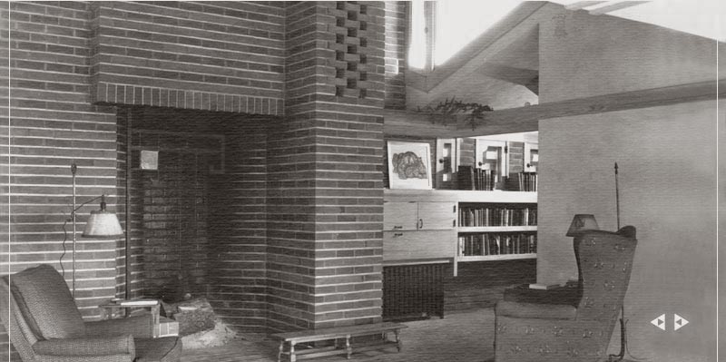
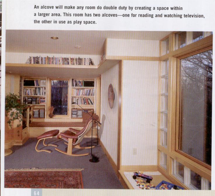
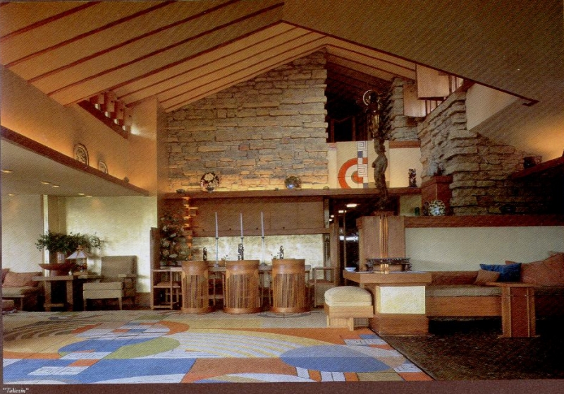
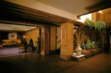
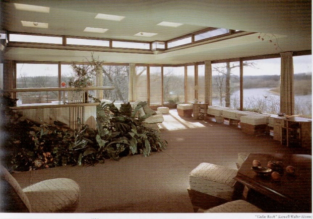
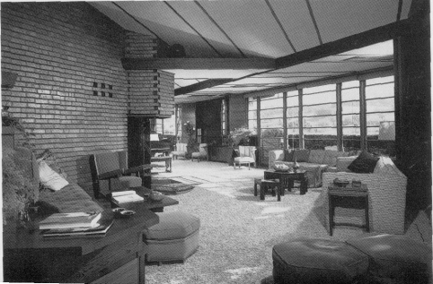
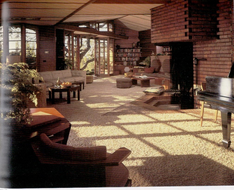
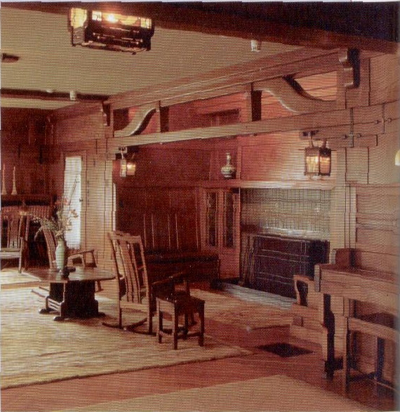
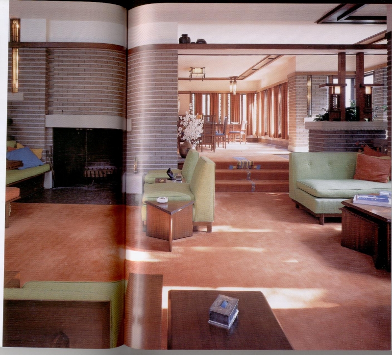
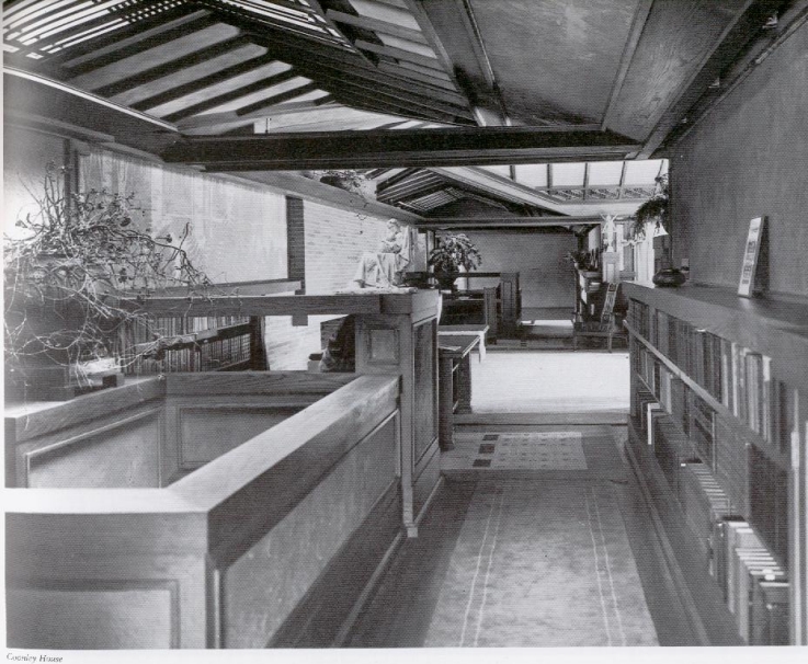
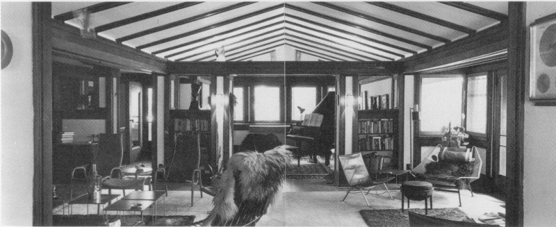
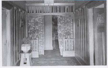
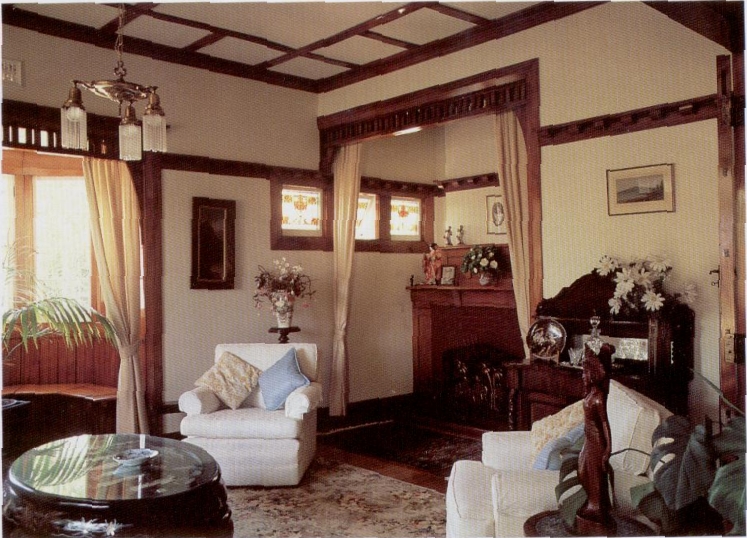
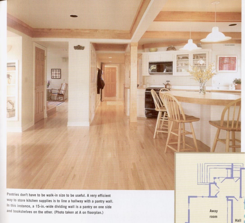
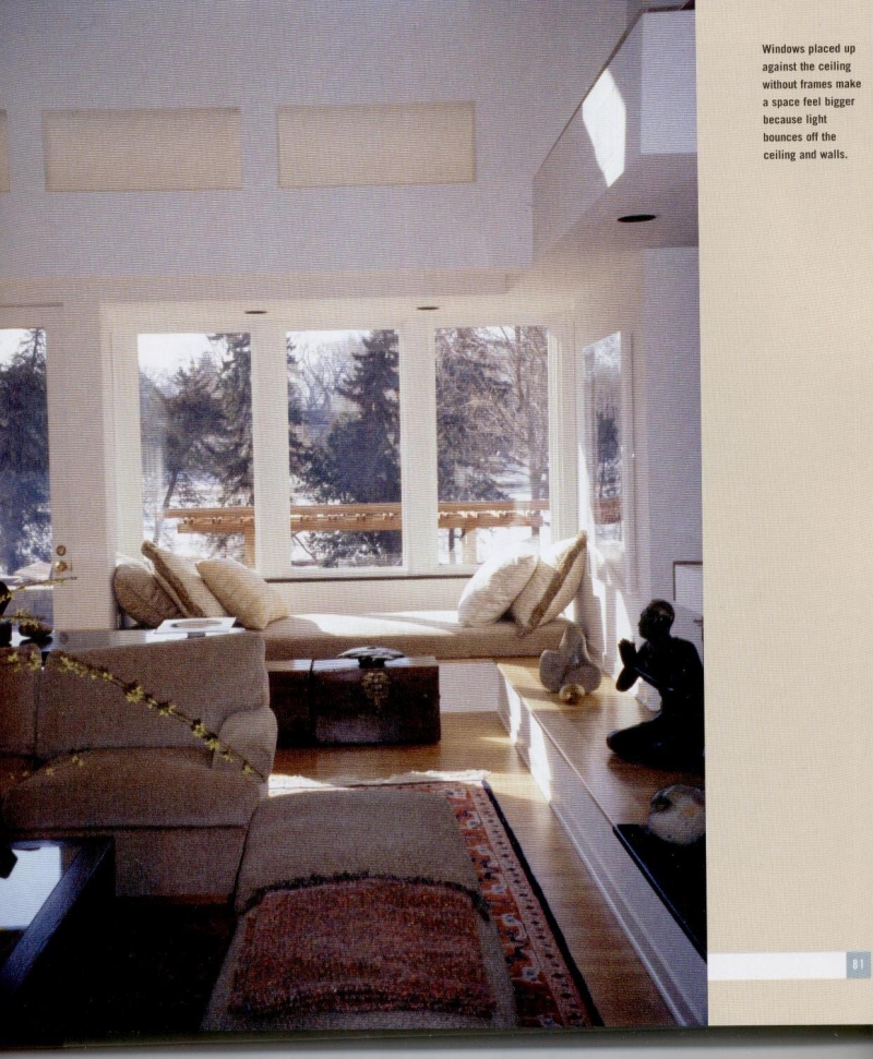
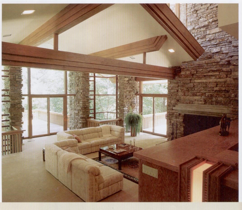
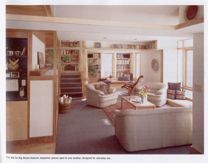
A ceiling deck, or a lowered ceiling, can be in any style and suit houses of any era. Here are some examples of lowered ceilings, ceiling decks, ceiling dividers and “picture rails” (used to suggest a lowered ceiling) using different styles, and from different eras, all of them successful. See if you can see all the designers are hoping to achieve in each case:

Click to enlarge image... Click to enlarge image... Click to enlarge image...

Click to enlarge image... Click to enlarge image... Click to enlarge image...

Click to enlarge image... Click to enlarge image... Click to enlarge image...

Click to enlarge image... Click to enlarge image... Click to enlarge image...

Click to enlarge image... Click to enlarge image... Click to enlarge image...

Click to enlarge image... Click to enlarge image... Click to enlarge image...

Click to enlarge image... Click to enlarge image... Click to enlarge image...

Click to enlarge image... Click to enlarge image... Click to enlarge image...

Click to enlarge image... Click to enlarge image... Click to enlarge image...

Labels: Architectural Mini-Tutorial, Architecture