Tuesday, October 17, 2017

Lykes House, by Frank Lloyd Wright


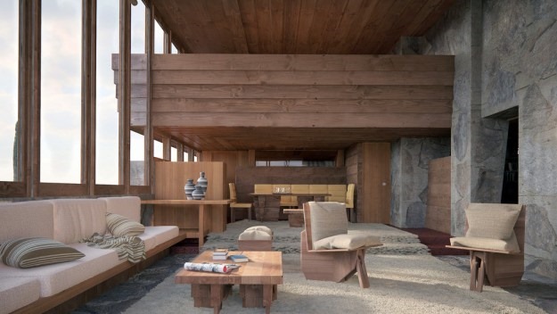
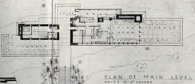
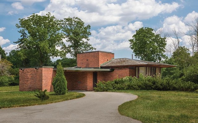
Officially the last house that Frank Lloyd Wright ever designed, this 280sqm house for the Sonoma Desert in pre-airconditioned Arizona was completed after his death by apprentice John Rattenbury, working from the master’s sketches — and adding both a pool, and an upstairs office.


The lounge, this great space, looks over the desert to what is now the city of Phoenix, its lights twinkling in the distance of an evening.


And it’s all yours (well, it could have been) for just $3.6 million. See: great architecture appreciates.


.
.

Saturday, October 14, 2017

Q: What is organic architecture?


"Organic architecture is an architecture from within outwards — in which entity is the ideal. … Organic means, in a philosophic sense, entity. Where the whole is to the part and the part is to the whole. Where the nature of the materials, the nature of the purpose, the nature of the entire performance becomes a necessity and out of that comes what significance you can give the building as a creative artist." 
~ Frank Lloyd Wright, from his interview (above) with Hugh Downs
.

Saturday, October 07, 2017

Quote of the Day: "I finally got why architects spend as long as doctors getting an education"

Burridge-Read Residence designed by architect David Boyle
“People say ‘location, location, location.’ They never say ‘design, design, design.’ I finally got why architects spend as long as doctors getting an education. They do something really magical. They don’t save lives but they enhance them.” 
~ Tim Read, owner of the Burridge-Read Residence (above), quoted in the article 'Selling architect-designed homes: real estate agency that markets on architectural merit not location'
.

Monday, September 25, 2017

"Those are the ones that should really go to jail."


"Paul Newman will have some time in jail to read up about architecture. Maybe he can even study for his exam and, no doubt, pass it. He could even emerge as a good contributor to the discipline and the profession. But what worries me more than the presence of a few shady and crafty operators such as Newman is bad architects who, under the cloak of licensure (and without the [architects institute] or anybody else able to do anything about it), commit crimes against our landscapes and lives on a daily basis. Those are the ones that should really go to jail." 
~ Aaron Betsky, dean at the Frank Lloyd Wright School of Architecture at Taliesin and Taliesin West, on the jailing for seven years of a man for practising architecture without the state's license
.

Thursday, August 03, 2017

Frank Lloyd Wright | HOW TO SEE the "American Home"


More from Manhattan’s Metropolitan Museum of Art’s’s important ‘Unpacking the Archives’  exhibition, unpacking the 150 years of archives of architect Frank Lloyd – this video (part of a series) unpacking yet another delightful series of artefacts.

This snippet: a brief introduction to Wright’s presentations, over several decades, of systems for ‘The American Home.’


.

. 

Tuesday, August 01, 2017

Recent Project: New kitchen in home renovation


The wonderful kitchen designer with whom I often work, Leonie Von Sturmer, is far better at self-promotion than I am — and here (above) on the front cover of the latest Trends magazine is the new house and kitchen we recently worked on at Greenwood’s Corner, Auckland.

With its new roof carefully located to manouvre through council’s height-in-relation-to-boundary controls, I love the way you can relax at the kitchen counter with a beer, enjoying the birdlife and foliage of the surrounding trees through the glassed gables and dormers.

(If I say so myself), it makes for a surprisingly open and informal setting in a relatively constrained site.
.

Wednesday, July 19, 2017

Frank Lloyd Wright at 150: ‘Unpacking the Archive’


To me this is far more important than any stupid election: Manhattan’s Museum of Modern Art (MoMA) celebrating the work of Frank Lloyd Wright 150 years after his birth.
Frank Lloyd Wright was one of the most prolific and renowned architects of the 20th century, a radical designer and intellectual who embraced new technologies and materials, pioneered do-it-yourself construction systems as well as avant-garde experimentation, and advanced original theories with regards to nature, urban planning, and social politics. Marking the 150th anniversary of the American architect’s birth on June 8, 1867, MoMA presents Frank Lloyd Wright at 150: Unpacking the Archive, a major exhibition that critically engages his multifaceted practice. The exhibition comprises approximately 450 works made from the 1890s through the 1950s, including architectural drawings, models, building fragments, films, television broadcasts, print media, furniture, tableware, textiles, paintings, photographs, and scrapbooks, along with a number of works that have rarely or never been publicly exhibited. Structured as an anthology rather than a comprehensive, monographic presentation of Wright’s work, the exhibition is divided into 12 sections, each of which investigates a key object or cluster of objects from the Frank Lloyd Wright Foundation Archives, interpreting and contextualising it, and juxtaposing it with other works from the Archives, from MoMA, or from outside collections. The exhibition seeks to open up Wright’s work to critical inquiry and debate, and to introduce experts and general audiences alike to new angles and interpretations of this extraordinary architect.
Exciting!

Here's the lecture/interview celebrating what’s been and being unpacked:

.

Wednesday, May 31, 2017

Bruce Goff's Crystal Chapel


Bruce Goff’s luminous Crystal Chapel, designed in 1949 and sadly unbuilt, but recently modelled digitally so you too can see the genius …

Tuesday, May 16, 2017

Recent Project: Howick renovation


ConceptSketch

Among the many projects currently in the office is this one, a renovation of a mid-century modern in Howick, offering opportunities to rethink New Zealand’s modernist heritage, and to undo  some of the later “modernisations.” And, like every renovation project, it involves a bit of untangling …

LayoutConcept

ConceptSection

Friday, May 05, 2017

Recent Project: Remuera Bungalow


Among the projects on the boards here is this one, untangling an existing Remuera bungalow and better connecting its occupants to sun, to views, and to its difficult site.

It's always fun teasing out the hidden potential of Auckland's many California Bungalows, too often far too little exploited...

Bungalow-Remuera002


Bungalow-Remuera001
.
.

Tuesday, May 02, 2017

Bruce Goff, architect


While I was visiting Canberra recently (as my more astute readers spotted), I met up with inspirational practitioner of organic achitecture Laurie Virr — to the delight of both of us.

Bruce Goff has been an architectural hero for us both over many years, but never having heard him speak, I was delighted to find that Laurie had a video of Goff talking about and visiting many of the homes he’d designed: homes as unique as the characters he’d designed them for.

The video quality is poor, but I find every minute thrilling!

.

Friday, April 28, 2017

Recent Project: Montessori school


Another recent project here on the boards: This is a new three-classroom Montessori school in a central Auckland suburb, behind two existing houses used as admin and accommodation.

The roof forms add interest from the (higher) local street -- and also (very importantly) shade direct sun while allowing in plenty of indirect light, making the spaces bright, clean and open.

The inner and outer spaces in each of the classrooms (or environments, as Montessorians call them) give two contrasting types of space within the larger realm: the larger central space a well-lit interior, the others as "saddle-bags" around it relating directly to the decks, gardens and planting beyond the doors and windows. The number of these spaces maps the number of pedagogical areas in each Montessori environment.

The buildings themselves are child-scaled, and the geometric play mirrors the similar play the children themselves undertake in the Montessori environment ...


.

Thursday, April 27, 2017

Recent Project: Victoria country weekender


Another of the things I’ve been working on recently: This one for a small, inexpensive weekender on a tiny Victorian country street -- taking advantage of mountain views, an equable climate, trees to the rear, and an affordable materials system … and exploiting "shared space" inside.
16018-Perkins~19 - Picture # 1
16018-Perkins~19 - Picture # 3
16018-Perkins~19 - Picture # 4
16018-Perkins~FloorPlan-web
16018-Perkins~StreetFrontCutawayPlan-web

Wednesday, April 12, 2017

Recent Project: Office/Showhome


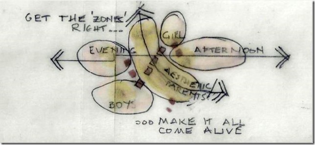
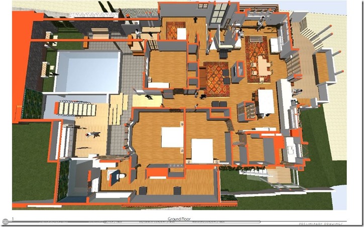
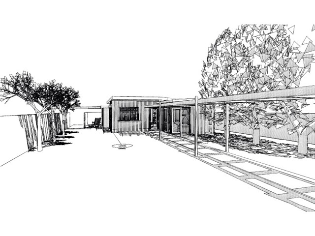
Another project on the boards, part of a bigger project to put together an affordable materials system to build (hey presto!) affordable homes.

This project is a small part of that bigger whole: a small, experimental, stand-alone office and training centre for up to 15 people — that doubles as a show home (which itself is part of that whole other story).

The design is very subtly complex, exploiting interlocking spaces in all three dimensions to do much with fairly little. (And, yes, sliding cavity doors close off each of those corner spaces when desired.)


.

Thursday, February 23, 2017

Housing: Variety through repetition


1_ VIEW-web

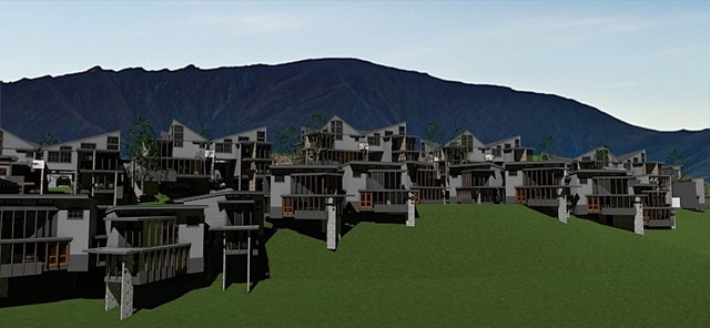
Designing a house form that works and that can be replicated to produce variety is fun, and economical, but not straightforward.

7_VIEW I-web

This project, by Organon Architecture, has 36 houses of two types; two types whose lower floors are identical and whose upper floors differ only in their orientation – and in that difference lies the difference that produces the difference: two house types in which the way they come together creates the structure of the composition, produces the interest, creates (with the simple form becoming complex by repetition and the relationship to the other repeated units) creating the relationship of composition to landscape.

2_web

Repetition means ease of assembly. Repetition means making use of industrialisation to reduce costs and waste. Repetition, here, producing variety instead of conformity.

That’s they way nature does it. That’s the way to make it work.

I think it does.

Could you live here?

5_VIEW INTERIOR-web.

Monday, January 23, 2017

Quote of the Day: “Not only cathedrals … ”

“Not only cathedrals, but every great engineering work is an expression of motivation and of purpose which cannot be divorced from religious implications. This truth provides the engineer with what many would assert to be the ultimate existential pleasure.
    “I do not want to get carried away with this point. The age of cathedral building is long past. And, as I have already said, less than one quarter of today’s engineers are engaged in construction activities of any sort. But every man-made structure, no matter how mundane has a little bit of cathedral in it, since man cannot help but transcend himself as soon as he begins to design and construct.”

~ Samuel Florman, American civil engineer, general contractor and author, from his book The Existential Pleasures of Engineering

.

Sunday, January 22, 2017

Quote of the Day: Form ever follows function …


“[T]o the steadfast eye of one standing on the shore of things … the heart is ever gladdened by the beauty, the exquisite spontaneity, with which life seeks and takes on is forms in an accord perfectly responsive to its needs. It seems ever as though the life and the form were absolutely one and inseparable, so adequate is the sense of fulfilment.
    “Whether it be the sweeping eagle in his flight or the open apple blossom, the toiling work horse, the blithe swan, the branching oak, the winding stream at its base, the drifting clouds, over all the coursing sun, form ever follows function, and this is the law. Where function does not change form does not change. The granite rocks, the ever brooding hills, remain for ages; the lightning lives, comes into shape, and dies in a twinkling.
    “It is the pervading law of all things organic and inorganic, of all things physical and metaphysical, of all things human and all things superhuman, of all true manifestations of the head, of the heart, of the soul, that the life is recognisable in its expression, that form ever follows function. This is the law.
    “Shall we, then, daily violate this law in our art? Are we so decadent, so imbecile, so utterly weak of eyesight, that we cannot perceive this truth so simple, so very simple?”

~ Architect Louis Sullivan, in his 1896 article ‘The Tall Office Building Artistically Considered

.

Friday, January 13, 2017

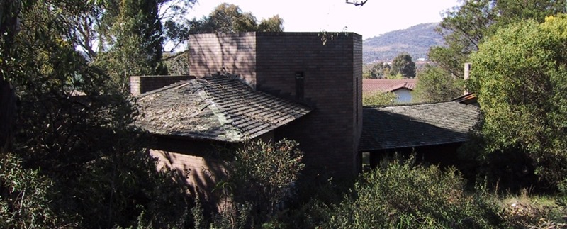
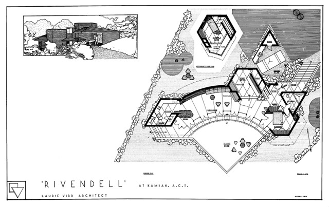
Rivendell et al, by Laurie Virr [updated]


img_04

Architect Laurie Virr has lived and worked in Canberra most of his life, where he has been something of an apostle for organic architecture, especially that practiced by Frank Lloyd Wright.

His first house in 1969 was (and still is)

an unusual Canberra example of the late twentieth century organic style of architecture based on a triangular module. The house was Laurie’s first commission in Canberra and displays the themes he would explore in his residential projects over the next three decades: the use of massing, geometric forms and deep roof overhangs in an energy efficient, solar house.

His own house, dubbed Rivendell and designed in 1975,

is an outstanding example of the late twentieth century organic style with its massing, use of geometric forms, deep roof overhang and energy efficient design. The successful implementation of a complex geometric plan based on a hemicycle is unusual if not unique for a mid-century Canberra house. The house has been published many times, in the U.S.A., Europe and Australia. Inexplicably, it is relatively unknown in Canberra.

img_01

The roofs and brick masses of Rivendell, looking north towards the Mount Taylor Nature Reserve


Convinced that government-financed housing had been a disgrace rather than a grace to the Canberra landscape, he set out to prove what was possible --

to design a house no larger in area than welfare housing of that time, 102.4m2,  but one in which the siting, the exploitation of space, the massing, the concern for the environment, and the details, expressed in unequivocal terms what I considered to be architecture.

Rivendell4
Dining area of another Laurie Virr hemicycle, at Valla Beach, New South Wales


Taking his brief from his wife (no architect should deliver his own brief, he reckons) and allowing the site to suggest the house that could deliver it, he began a study of hemicycle houses, first designed by Frank Lloyd Wright for the second Jacobs House, and designed this passive solar masterpiece for him and his growing family. Taking his cue from Louis Sullivan’s edict to “take care of the terminals and the rest will take care of itself” he held the public spaces of the hemicycle between the orthogonal cavity brick masses housing retreats, servicing spaces and study.

VIRR-rivendell

The French doors and stationary glass on the north face of the house encompass an arc of 90o [he explains], making it an architectural expression of the problem. This is also exemplified by the walls that define the terrace and mark the extent of the glazing.

Rivendell5

Courtyard of Laurie Virr design at Murrumbatemen, New South Wales


Built with his own hands, he has lived and worked there –very comfortably -- ever since.

There are just two people living in the house at this time and it is comfortable for us, but there was an occasion when 56 folk gathered within and there was room for all.

img_02

Beautiful!

[Images from Laurie Virr’s site, Canberra House, and Wright Chat.]

NB: UPDATED 15 Jan to add corrected captions.

.

Wednesday, January 11, 2017

Fallingwater


Does this animation of Frank Lloyd Wright’s ‘Fallingwater’ (set to Smetana’s ‘Moldau’) ever get old?

No, I don’t think it does.


Fallingwater from Cristóbal Vila on Vimeo.

.

Friday, December 09, 2016

The ruins of the “City of Culture, ” Galicia – by Peter Eisenman


ENTR ECOT | Cidade da Cultura from urbanNext on Vimeo.

Back when I was studying architecture at Auckland uni, starchitects like Peter Eisenman were all the rage.

Galicia3

My own sympathies were with the architecture of Frank Lloyd Wright, and work like it that embraced human life. Architecture like Eisenman’s I characterised as neutron-bomb architecture – architecture from which all human life and humanity were rationalistically erased.Galicia2

For the most part however, neutron-bomb architecture was what my lecturers wanted. This, they held, is architecture with real rigour. Wright, and work like it, was mostly shunned.  What they wanted was architecture generated not by life, but by diagram.

Galicia4

So it’s with great sympathy for the good people of Galicia, Spain, who had inflicted upon them in the name of said rigour the architecture of Mr Eisenman, an abomination never completed but which has left them €475.9 million in a hole. All that’s left to show for it is the

hulking cultural complex Ciudad da Cultura de Galicia (City of Culture of Galicia) sits incomplete and empty. Commissioned to the American architect after an international competition hosted by the Parliament of Galicia, the cultural center presented an ambitious feat of construction on the slopes of Mount Gaiás… [C]onstruction of the six-building complex endured during the 2008 Spanish recession, and as costs for the building’s materials and construction continued to rise, the project became a crippling burden on the regional government of Galicia… Considered a “white elephant” to the government and the people of Galicia, construction of the project was halted in 2013.

What rigorous vision is being imposed here?

The parametrically configured design was conjured by overlaying the map of the city of Galicia on top of Mount Gaiás’s sloping topography. The result was a series of granite-clad slopes interconnected by streets and plazas meant to invoke an urban environment.

This is what passes for rigour in the rarified world academic architecture: a 3-dimensional multi-million-euro equivalent of the scribble patterns you drew in kindergarten. The result, in reality? A White Elephant, as Peter Eisenman’s Ambitious “City of Culture” Fades Into Ruin.

[U]ndulating marble forms that extrude from the earth are flanked with scaffolding, metal barriers and caution tape. Shrubs and weeds have already begun to sprout between the cracks of the pink granite panels. Despite a few pedestrians, the site remains empty, untouched, all too uncannily fulfilling Eisenman’s vision of an “archaeological” site.

How appropriate.

Galicia1

The suspicion will be that if completed the work may have appeared more humane. If you truly think so, just Google his finished work …

[Film by ENTR_ENCOT. Pics by Architizer.com, Alex Lievens]

.

Monday, November 21, 2016

Rose Pauson House, by Frank Lloyd Wright


25387325729_52a70715a9_b_d

One my personal favourites designed by Frank Lloyd Wright is the delightful little desert house he designed for Rose Pauson that was sadly destroyed by fire not long after its creation.

It does make a beautiful ruin, but a tech whiz at the Hooked on the Past blog has reproduced it virtually with the aid of AutoCAD and a bit of trickery.

31023493745_e2525898df_b_d

Wonderful!

Head here to see it all, including the story of the virtual creation.

25387324909_6d3a57e565_b_d

PausonGroundFloorPlan

[Pics by Hooked on the Past, Wright Chat]

.

Thursday, September 15, 2016

“The joy of growing up in a home designed by Frank Lloyd Wright”


INdiana
Frank Lloyd Wright’s modest Haynes House, in which Thomas French grew up
{Pic by Tony Valainis, ‘
Indianapolis Monthly]

We build our houses, observed Winston Churchill, and then our houses mould us. Writer Thomas French reflects on the joy of a childhood moulded by a genius, by the sheer joy of growing up in a home designed by Frank Lloyd Wright.

Growing up in a Frank Lloyd Wright house in Indiana meant living inside the famed architect’s imagination—an influence that stays with me still….

Architect Claude Megson writes that a house isn’t just a garage to park yourself but “a whole universe for ourselves to inhabit,”a place reflecting our whole universe of needs and emotions. The universe of our own soul – and, for the family’s youngest, playing a large part in its creation. French’s description of the sensory excitement and natural joy transmitted by the house reflects Megson’s vision:

Wright’s design already was shaping me in ways I did not yet recognise. Small as it was, the house had enough room for my many moods, all the versions of myself that were emerging. Sometimes I could not bear the sight of my parents—not because they’d done anything wrong, but because I was 13. Other times I would happily join my mother in the kitchen, helping her bake oatmeal cookies, both of us bathed in sunshine from the skylight above. Before we moved to that house, I had never heard of anyone putting a window in a roof. Now I couldn’t imagine living without one.
    On stormy summer nights, [my sister] Brooke and I would turn off the lights in the living room and watch the dark clouds explode with lightning strikes that illuminated the yard and the woods and our faces. Together, we counted out the seconds until the ensuing thunder shook the room’s giant windows.
HaynesHouse    The house was tactile and primal, a wonderland of the senses and a trove of Jungian archetypes. In our bedrooms we hibernated like bears, dreaming on and on. When we woke, we shuffled through the long, low tunnel of the hallway until we were freed into the open space of the living room, endlessly repeating the sequence of compression and release. All of it seeped inside me slowly, almost without my noticing. Walking from room to room, I absentmindedly ran my fingertips along the red-brick walls, tracing the stubble of gray mortar. The air carried a faint scent of cypress that was strongest in the library. The clerestory windows across the top of the walls in the hallway were carved into vaguely geometric shapes. I got it into my head that these shapes formed a code and that the master was speaking from beyond the grave, waiting for someone to decipher his message. I never cracked the puzzle, but the windows gave the entire house a sense of mystery that I found satisfying.
    The house and its creator were teaching me to hold still long enough to see patterns all around me—in the movement of sunlight across the kitchen, in the shadows of the trees at the edge of the woods, in the way our family broke into a symphony of cries and complaints in the mornings before we left for school and work, which crescendoed again in the evenings as we got ready for bed. Wright had sketched it out for us, this fabric of connection and meaning, and now I was paying attention…

Frank Lloyd Wright helped me navigate the rapids. When he designed our house, he had been an old man who knew a great deal about life and death, creativity and loss. He was an artist, fully formed and fully aware, on the edge of his final journey, and he had bestowed upon us his maturity, his wisdom, his abiding calm and limitless passion. The balance of light and dark he created inside that house was durable enough to contain the storms inside me, our family’s ups and the downs, all the multitudes within us. When I struggled, the walls cloaked me in quiet. When I felt strong, I sat in the living room and gazed out those big windows toward the horizon, imagining the blank pages of my life waiting to be written.

What a beautiful tribute to the house that shaped him, “a testament to one artist’s beguiling vision of a country where all of us, not just the rich, can lead lives of beauty and grace and possibility.”

.

Wednesday, September 14, 2016

Architectural Mini-Tutorial: Using tricks to deliver meaning


The human eye can be 'tricked' * -- something of which every decent artist and architect is aware.

Take this tricked-up meme currently doing the rounds,

an image of intersecting grey lines against a white background, with 12 black dots on the nodes where the grey lines meet.
    All 12 dots are really on the image, but most people are unable to see them all at the same time, making the dots seem like they appear and disappear with every blink. This occurs because the eye’s stimulated light receptors can sometimes influence the ones next to them, creating illusions.
    In this particular image, tweeted by game developer Will Kerslake on Sunday, the brain can see some black dots but guesses when it fills in the peripheral vision. Because mostly grey lines appear in the periphery, the black dots don’t appear…
    How many dots can you see at once?

Dots

So because we perceive in a certain way, artists and architects use this in their work.

Based on understanding how we perceive colour and colour contrasts, artists use it to create real spatial depth in paintings.

Based on understanding how we perceive light (strong contrast between light and shadow needed to see real contrast), artists use it to create life and excitement on a canvas, and architects to create it in spaces.

Based on understanding howwe perceive colour in light and shade, architects use it to select darker colours on a window wall to relieve glom inside and better connect us with nature outside.

Based on understanding how we perceive continuity and spatial enclosure, architects use it to 'break the box' and expand the sense of space.

Based on understanding how we perceive the visual field, architects use it to order space and to ‘capture a view alive.’

Yes, these are all visual tricks. But they work because they respond to the ways we perceive, and because they work they can and are used to create real meaning.


* This does not mean the eye is unreliable - it simply means that (in the case of refraction, for example) it often shows us more context than we know, so while our perception is automatic what what we perceive sometimes needs interpretation.

[Hat tip Kaila Geary Halling.]

.

Thursday, July 07, 2016

Architectural Mini-Tutorial: More about windows


Neutra-Hailey-Residence-living-room

“So, what about our windows?” It’s usually a half-asked question at some early stage of a project, about the colour of windows generally – which are usually picked by someone who has a favourite colour they see in a brochure – or about how many windows in a space – just so many holes punched in a wall -- but the placement and colour of your windows is more important than you might think.

Consider it from the point of view of perception, as architect Richard Neutra used to. Former Neutra apprentice John Blanton explains the importance of size and placement:

Studies in neuroscience in architecture will continue to show the benefits of bright, daylight rooms..
    Lowering costs through simplicity was always a factor for [Neutra] so that the client could afford gracious social areas within a limited budget, which he took very seriously.
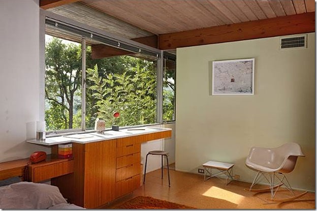
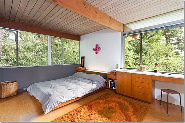
    A room with a single exposure, especially a bedroom or business office, is the hardest to work with. Neutra’s answer was wall-to-wall windows, but not necessarily floor-to-ceiling. Extending them to the corners created light onto, and gained reflection from, the side walls. This accomplishes brightness with lessening of glare. Some light from those walls reflects back onto the solid portion of the window wall, again decreasing glare. Thus, a feeling of a dark cave wall with a single overly bright opening was avoided.
    The effect of opening up the room is further enhanced because the eye flows to the nature beyond the glass, unhampered by the enclosure of dead corners. I have long believed that glare is caused by the eye’s rapid re-focusing between light and dark. This is stressful, which is why it is uncomfortable. Together with similar adjacent rooms, these wall-to-wall windows produced a long ribbon window on the exterior.

So it’s not enough just to punch a hole in your wall: to avoid the dark cave means more glass than you might have thought: and  glass especially going to the corners, so light can fully wash the internal walls.  (And feel free to even take the glass round onto the next wall plane itself to fully open up your corners!)
Neutra-Hailey-Residence-bedroom-3

And bear this in mind when you’re hanging your curtains: make sure you have enough curtain rail to take all of your curtains well past their window when they’re open, and to draw them away from any adjacent wall lest they remain and cast the very shadow you’re trying to avoid.

Notice too that the exterior effect (the long ribbon window) is produced by the interior purpose, that purpose being to avoid glare and dark corners, and fully open up the space to nature outside the glass. This connection, Neutra believed and neuroscience has since confirmed, is essential for human health and well-being.

Bear in mind too, especially if fitting blinds, that because the brightest part of the ‘sky dome’ is directly above us, we will get most of our light through the window’s top-third, so unless you do want that dark cave you’d best avoid having your blinds bunch up at the top of your window.
Neutra-Hailey-Residence-bedroom-2

So what about the colour of your windows, and the window walls? Does perception play a part in suggesting how to handle these? Sure does: to minimise the contrast between the outside brightness and the shadow unavoidably cast on the inside of your window joinery, Neutra always favoured the light-reflecting colour of silver. But for his window-walls themselves, something much richer:

The walls below Neutra’s continuous windows might have built-in cabinetry or in a colour different than the white side walls, perhaps the favorite colour of a child occupant. If white paint were to be used below the windows as on the side walls, that low band of paint would actually appear to look dirty because less light is being reflected there. However, because using a colour could detract from the view outdoors, which was his invariable goal because it promised the most actual health benefit, he did this on an individual basis. Ideally, his choice for this lower band was his chocolate “Neutra Brown.” This particular brown, it seems to me, is a “magic colour” in that the eye identifies it but does not attempt to focus on it, so its use is oddly comforting, as I have experienced.
    Any post in this extended bank of windows was usually painted silver, another “magic” colour. It created the least amount of contrast with the incoming light, and it almost made any post disappear to create openness. Again, expansiveness! Additionally, Neutra ensured that any vertical sliding door jamb would be hidden on the exterior side of a post or wall. Likewise, he concealed the horizontal head of such door so that it was hidden within or behind the roof framing. Again, openness, rather than a sliding door frame silhouetted within the structural frame, which would pose another obstruction to our view of the outdoors. It is an experience so subtle that it is not seen other than subliminally.
    All this gives us the “Neutra impact.” We do not look at his windows, we look through them.

That’s the reward of we get it all right: by starting from the inside out, letting the function dictate the form.

I hope this Mini-Tutorial has helped you see the placement and colour of your windows rather differently.

Feel free to check out all the other Architectural Mini-Tutorials for more fresh ways to see architecture.

Neutra-Hailey-Residence-bedroom

* * *  Pics used show Richard Neutra’s Hailey House, pics by Angeleno Living. Text quoted from Barbara Lamprecht’s wonderful Neutra blog.

.