If we want to “break the box” instead of make a box, when we build our houses we need a few tricks up our sleeve.
A while back I talked about how ceiling decks are one of those tricks. Another is using “nested spaces” within a place.
Today I’m going to talk about how the way we perceive what’s called “the visual field” in front of us can be used to reduce the sense of enclosure.
It seems almost obvious to point out that we can never see all of a building at once. In The Dynamics of Architectural Form, Rudolph Arnheim discusses this, explaining that we perceive architectural space only “in pieces,” by eyes and head “roving back and forth over the edifice and by traversing around it,” and combining these in memory to build up a 3d model in our mind. And like coming to understand a painting, he says, we begin by examining the “visual field.”
In observing a painting, this perceptual process identifies the various elements and relations that constitute the work. A perceptual listing is prepared consisting of a description of shapes, an identification of each colour, and an examination of the relations of individual elements.1
In a shorthand way, this means identifying all the main visual elements you see – shapes, lines, colours, relations between elements -- that visually organise the space. This doesn’t mean identifying the elements that hold a building up (although in many a good building the two things coincide) but the things in your visual field that constitute the main visual presence.
In a sense, the elements visually organising the space would be the main lines you would sketch if you had just, say, a minute to draw your point of view – or what you would see if your squinted your eyes.
Consider the 2d representation of the space below built a few years back in Hamilton:

So, what are the main shapes, lines and colours organising the visual field in this picture?
I’ll give you a moment while you squint your eyes, or scratch out a quick sketch. (Don’t worry if it’s a bit rough.)
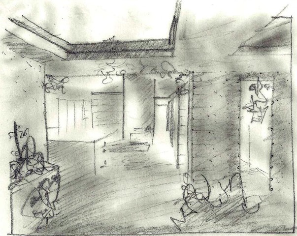
Okay, here's my two-minute sketch, at the bottom of the page, below the fold.
The point being that the dominant elements organising the visual field for the observer, from this view, are primarily:
a) the vertical masonry piers,
b) the coloured vertical 'pier' at the end of the main space,
c) the vertical corner to the left, and
d) the floating ceiling deck overhead.
Why is that important to what I’m talking about here? Because, crucially, NONE OF THESE ELEMENTS CONTAIN THE SPACE.
Think about it. Look around the box you’re undoubtedly sitting in now. In a simple box, what defines the space visually – what defines each observer’s visual field within the space -- are the very things that contain the space, i.e., the walls and ceiling. So the visual field offers you a sense of containment.
But if you can define the space without reference to the things that contain it, then the 'container' starts to disappear, and space appears to flow more freely. The visual field offers you a sense of freedom.
In other words, by taking away the visual dominance of the things that contain your space, you allow the sense of space itself to dominate.
In other words, this is one way to begin BREAKING THE BOX.
There are two bonus features with this little trick.
- As you can see in my sketch below the fold, the ceiling deck is a major element in organising the visual field. If we can then take this outside by means of pergolas, say, that will essentially take this same organisational motif outside, then we can really begin organising our perception of space both inside and out without reference to our “container,” and we can begin to realise “inside-outside flow” much more dramatically than by simply adding a few sliding doors.
- If our organisation of the visual field is strong enough, then we can “clutter” our kitchen benches and tables as much as we like, because the organising elements will still be be organising the visual field for us; unlike in those stark bare boxes you see in magazines, that look untidy with a small coffee cup on a pristine bench.
In short, it’s a simple yet relatively sophisticated method by which to make a space for relaxed day-to-day living with a genuine sense of freedom.
Cool, huh.
NOTES:
1. Quoted from the description by James Harris from his book Fractal Architecture: Organic Design Philosophy in Theory and Practice.


No comments:
Post a Comment